Sword Art Online unit frames
Hello!
I don't know if any of you have seen the anime called Sword Art Online, but it's pretty neat, and I really like the style of the game's UI. So I was wondering if Sword Art Online like unit frames exist, or could be made through another addon like pitbull? For those of you who don't know what they look like, click here. Any similarly modern-looking UI addons would also be very much appreciated. |
That is certainly possible, though you would need the textures for it (or recreate them).
This is not the same style, but have you seen oUF_Real? http://www.wowinterface.com/download...-oUF_Real.html |
Sweet!
Well, I downloaded a skin for another game called osu! which included some textures, like the hp-bar background. It also includes the green of the hp-bar, but I would like it to progressively change color from green to red, and I have no idea how I'd do that. I have no experience in any of this stuff though. And that addon is really neat! I'm using it right now! |
If you are using a unit frame addon, look for color context setting based on health for your health bar(s).
Quote:
|
Quote:
|
Bars don't have to be squares, most (if not all) unit frame addons will let you choose which texture to use for status bars.
Quote:
|
Just want to let you know Humfras and I are working on Sword Art Unitframes that Look like the One on the pic. Have you any idea/Vision how to add power/mana/combopoints?
|
Quote:
I guess you could add combo points, runes, holy power etc. on an extra bar on top or something. Maybe with an option to disable them for people who use nug combo bars or the likes. Now power is a bit trickier.. Maybe you could fit it in the gap you have behind where the health bar tapers? In it's own little similarly-shaped box. And/or you could make a version using the UI from ALfheim Online which appears later in the series, here's how that looks for reference. EDIT: I just made this to show what I mean :3. Of course, combo points would be on the target frame. Ooh, and another place to put the power bar could just be underneath the health bar, and have it follow the /-thing it has going on. |
Quote:
http://i.imgur.com/wR3cGxs.jpg It's pretty much as kenny mentioned, but another way is to add the CP to right above the health in order to keep everything inside the border. |
1 Attachment(s)
Quote:
|
What you think about this one
http://i.imgur.com/a3TN9M9.jpg |
Quote:
|
Quote:
|
Quote:
What I'd like to see is a mockup of how it would look like in WoW (I hope not as big as its in the screenshot) |
Currently trying out different combo points from 5-10 and
shadow orbs, Holy power, Soul Shard, Vehice Power/ Druid Mana. NO they don't show up all at the same time and not in this position :) Also added altpower the pink bar right under HP  |
For the combo points below the frame, it would probably look better if they were square. The slanted edges look out of place with the corner above it being squared off.
|
Hmm, I agree with Coote, it might look better square I think.
I'm curious though, what's the E / R behind the level for? |
probably to show elite/rare status, usefull on the target frame but not so much on a player frame
looks quite nice sofar :) |
I love this idea, it looks amazing so far. Has really inspired me to learn how to start doing stuff like this. Keep up the good work, can't wait to see a finished project.
|
How's it going?
|
Quote:
* sorting out visuals * creating animations ...    |
Looks very promising thus far!
Maybe a dumb question, but are you going to have it so the names are abbreviated? |
looks nice ingame :D
bit of feedback (mostly taste or matter of preferance though I guess): -I feel its a bit too big, especially when its in the middle of the screen. -Either always show the "Lv:" prefix or don't show it at all, but just from the looks of it there should be enough room there untill the level rises into the 3 digit territory -I know its just a demo sofar but i think the target frame should be mirrored on the vertical axis, though I don't think they ever really showed target unitframes in the anime (all they ever showed was player and party frames and a rounded frame at other units, probably comparable to WoW's nameplates) so it'll ultimatly be up to the developers... looking forward to more :) abbrieviating names might be a good idea and probably should go on the todo list for when the basic unitframe functions are realised |
They will be abbreviated but I hate it when there are names with ... at the end. WoW allows max. 12 letters for players and you can't take the 3 same letters consecutively so longest name woud be "Mwmwmwmwmwmw" so I thought about making the space for the name the unitframe in this length.
I'm still not very happy with it since it will look odd if your name is realy short or realy long. Also tryed to use rounded combopoints (Just have made the 4x Combopints yet to test them out). This is the new one  and this was the old one What combopoints do you like better? |
You can get names longer than that by abusing Æ and æ.
|
Quote:
|
Quote:
|
hmmm i think you are 'wasting' quite a bit of space beneath the manabar there, would it be possible to have the combopoints in that area and attach the party frames (assuming there will be some ;)) right beneath the playerframe as they showed it in the series.
I agree with what you said about too short or too long names that might be look odd, especially since for a targetframe the name area would have to accomodate even longer names something for when the basic functionality is done would be to have the alternative power bar (I assume thats what the pink bar is) have the same margin on its left as it has on top, should look better then more symetrically |
Will its not a super small unitframe anyway there are many UF that have minimal use of space so I don't see any reason to make this happen with an art unitframe like this one is.
I think names in 2 lines woud look bad too. Quote:
Also we are trying to stay as close to the Original SaO unitframes as possible. Can anyone post a pic of the original group frames in SaO? |
2 Attachment(s)
here you go, not sure if they ever showed a partyframe with more than 2 players but i'll go through the first half of the series just to check, its reasonably fun to watch anyways
was hoping to find something with more than just kirito and one more but I don't think there are any anyway attached another example for low health... additionally there is a few short scenes where there is a yellow or red blinking around the black border of the unit frame, I think they used that to highlight a debuff as the color was the same as the debuff icon shown next to the unitframe (not that that is practical for WoW considering the amount of debuffs some boss fights grace us with) I think the + in the second image denotes the partyleader, though i have no idea why it wasn't there in the earlier episode which I took the first 2 examples from |
Thanks for the Partyframes pics. We'll look into them as soon as the normal frames are done.
We decieded that putting the name on the top is the best solution. Its not looking exactly like the original any more anyway ;)  Top: Name / Alt power bar Center: Mana and HP are now separated and have a gardient. It was looking odd if your HP or mana was low so I separated them. Bottom: Going to use a combination of the rounded/oblique combopoints. Left side: Role icons will be attached here Bottom right: I think about adding indicators for Lootmaster/Raidleader/Raid icons (Color of them only) |
Quote:
|
That does indeed look quite nice :) and is I think a better use of the room available.
At least for me it was fairly obvious that making a 1 to 1 translation of the SAO unitframes wasn't really a possibility considering all the differences. but so far you made a very nice and clean looking unitframe inspired by SAO |
Role icons
DD icon (I love it!)
 Healer icon (ok what else did you expect :D)  Tank icon (Brrr this one was hard!)  Group frames will be next! What do you think? |
Quote:
|
Quote:
I you want to distinguish it more from the tank icon, the shield could have a couple of V lines down the face of it. |
Quote:
|
I think I'll have to agree on that, while what you are suggesting might look nice Fizzlemizz, the + sign fits better with the simplicity and the look of the unitframes.
The icons do look very nice Tonyleila, looking forward to what you do with the partyframes. |
Screenshots
I have looked a bit into Sword Art Online anime again and collected some screenshots. There is even one with debuff and a full zoom of the unitframes. Also some of nameplates and menus.
http://i.imgur.com/WMZ3uWe.jpg |
Quote:
|
Quote:
|
Quote:
|
Quote:
wouldn't it be possible to just put a border around the icons as they are shown ? Quote:
|
Quote:
|
Nooo you are understanding me wrong. The this indicator woud be an extra to the normal buff /debuff icons.
For the normal debuffs/buffs I woud just make a masque skin. |
Quote:
|
|
looks nice :3
2 questions/suggestions a) will we be able to position player and party frames independantly ? b) i'd love to be able to make the player frame nearly invisible when I am not in combat/grouped/in an instance, would be nice to have that |
I'm loving it! Awesome job!
|
Quote:
|
OMG must have this when it comes out, are you also planning on using the sounds from the anime as well for low health on other UI features? If somebody already asked im sorry for asking again :)
|
Any more progress so far?
|
I have some exp with sound addons so if you are interested in/want help with adding sound to specific in game events let me know and I will help
|
Quote:
|
Quote:
(note: non-pixel-perfect UI scaling!) 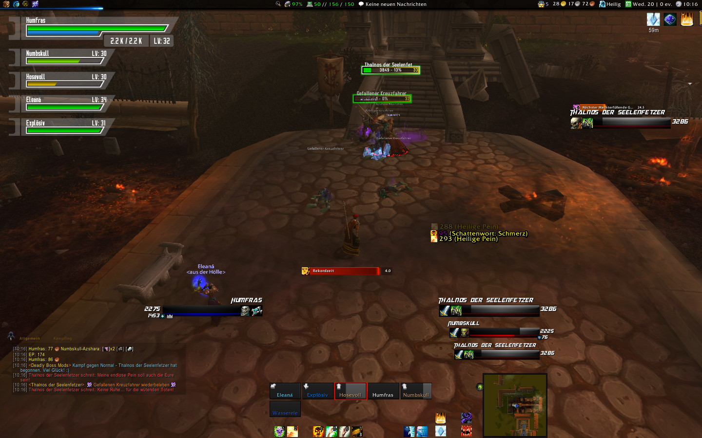 |
that actually looks quite nice and at least for me is quite readable
|
i must have this :O this looks awesome ;)
(btw bin auch n riesen sao fan und finds spitze dass du dir die mühe machst :D) |
Quote:
|
Config mode with player, target, group and boss frames:
 current group frames in LFG dungeon:  |
Hey those look really nice, made an account to post here.
I was wondering if it was possible for you to drop a download link so I can use them even in it's current stages? I really love SAO and would like to try them out currently |
| All times are GMT -6. The time now is 06:48 PM. |
vBulletin © 2024, Jelsoft Enterprises Ltd
© 2004 - 2022 MMOUI