WoWInterface

WoWInterface (https://www.wowinterface.com/forums/index.php)
-   UI Screenshots, Feedback and Design Discussion (https://www.wowinterface.com/forums/forumdisplay.php?f=144)
-   -   UI Feedback Thread (https://www.wowinterface.com/forums/showthread.php?t=38749)

Rocom 02-27-11 09:42 PM

Quote:

Originally Posted by Seerah (Post 230785)
What goes in those empty spaces between your action bars?

Nothing. Just spacing to make it look pretty

Seerah 02-27-11 10:02 PM

Quote:

Originally Posted by Rocom (Post 230790)
Nothing. Just spacing to make it look pretty

Ah. Just looks/feels like empty, wasted space to me. :)

Rocom 02-27-11 10:46 PM

Quote:

Originally Posted by Seerah (Post 230791)
Ah. Just looks/feels like empty, wasted space to me. :)

What could go there? Do you think it would look better if I moved the two side bags and attach it? it would leave empty space between the bars and the chat/recount frames.

harizon 02-28-11 01:39 AM


Been trying to make something that has a little touch of my own, which I guess it sorta has, but also a lot of blatant stealing of other ideas. Im using a lot of FreeUI (by Haleth) stuff. I dont have any cooldown addons setup, or raid frames. Party frames are basically the same as target, only over the chat to the left (like Carebear).

Thoughts?

Led ++ 02-28-11 03:43 AM

Your buffs (topright) and target buffs/debuffs should get a black border imo. Now it's more grey-ish.
The icon on your castbars is so small that it's rather useless imo. The ToT name looks strange too, imo just remove the health texts and replace it with the name.
Also the minimap border (colored for mail I guess) just doesn't fit the UI at all.
Bottom panel looks good (Ocularis ftw), tho I would place the mail and bags thing on the left. So your clock with the blue background is the last in line.

edit:
Oh and imo the chat could use a tad more spacing and your combat text (in the UF's) isn't aligned.

harizon 02-28-11 04:44 AM

Quote:

Originally Posted by Led ++ (Post 230809)
Your buffs (topright) and target buffs/debuffs should get a black border imo. Now it's more grey-ish.
The icon on your castbars is so small that it's rather useless imo. The ToT name looks strange too, imo just remove the health texts and replace it with the name.
Also the minimap border (colored for mail I guess) just doesn't fit the UI at all.
Bottom panel looks good (Ocularis ftw), tho I would place the mail and bags thing on the left. So your clock with the blue background is the last in line.

edit:
Oh and imo the chat could use a tad more spacing and your combat text (in the UF's) isn't aligned.

On my screen my buffs do have a black border (Ill give you my soul link buff on top right does look grey, but the rest looks black to me).
Castbar icon I agree with, was just testing really, its removed now.
ToT suggestion sounds good, Ill try that.
The minimap is straight outta FreeUI, will see if I can manage to remove the green mail reminder.
Doubt I need combat text in my UFs, will remove that.
Im using phanxchat, is there an easy to spot code line that determines spacing? Or is it something that Ill have to add?

Led ++ 02-28-11 06:50 AM

ChatFrame1:SetSpacing(2.5)

adds the spacing. (only for frame 1 I suppose tho) Ofcourse you can change the value to what you like.

harizon 02-28-11 06:57 AM

Quote:

Originally Posted by Led ++ (Post 230815)
ChatFrame1:SetSpacing(2.5)

adds the spacing. (only for frame 1 I suppose tho) Ofcourse you can change the value to what you like.

Awesome, thanks :D

edit: Is it possible to colorcode timestamps?

Saintvallen 02-28-11 07:30 AM

Quote:

Originally Posted by Rosoaa (Post 230671)
Which is better? The first UF or the second two?


First. bla bla bla 10 chars

Kendian 02-28-11 09:34 AM

Quote:

Originally Posted by Rosoaa (Post 230671)
Tell what you guys think.

Tried to do something like this UI: http://www.youtube.com/watch?v=68siAqFIU6w


I suggest zooming in on that pic it looks blurry. That light blue arrow will collapse/expand all the text.
______________________________________________________________________

Which is better? The first UF or the second two?


The second. Reason being (for me), is you already have a BG shadow, the front overlay texture doesn't need the shadow. Just my opinion, of course, they're both lovely.
:D Oh, and if you could give me a clue about how to streamline the collapse/expanding script for KGPanels, and how you did it with an invisible texture (the arrow is the texture?) I'd appreciate it. My collapse/expand scripting is positively ANCIENT, and needs 3 panels, at the very least.

Dawn 02-28-11 10:54 AM

@Rosoaa
Either the first, but without the shadow behind the frame or the second. Having the inner shadow and the outer one at the same time is just to much. :rolleyes:

Azande 02-28-11 07:05 PM

2 Attachment(s)
Tidied up a bit, clean screenshot the first, the second shows all my Power Aura displays.

strykerk 03-01-11 09:01 AM

Looking for ideas for hp text.
 
1 Attachment(s)
I recently redid my unit frames so they are vertical. I am kind of missing having hp/mp(not as important) on my health bar.

I am wondering if anyone out there has any ideas on where to place it.
I thought about extending the name bars under the player and target, but I think that would look funny.

Any tips/ Ideas are welcomed, I am just stumped on this.

It is stuff btw, if you need that information.

Kendian 03-01-11 10:21 AM

1 Attachment(s)
Quote:

Originally Posted by strykerk (Post 230881)
I recently redid my unit frames so they are vertical. I am kind of missing having hp/mp(not as important) on my health bar.

I am wondering if anyone out there has any ideas on where to place it.
I thought about extending the name bars under the player and target, but I think that would look funny.

Any tips/ Ideas are welcomed, I am just stumped on this.

It is stuff btw, if you need that information.

Honestly, I've dealt with this problem for AWHILE, lol. Your safest bet is to widen the unit frames them selves, and put it dead center. Just my opinion, tho. Or even keep them the same width, and have the text truncated. OR, lol, Put them above/left/right/below, and use stufs built in check box, 'only show on mouseover'. Hope this helps. :)

strykerk 03-01-11 10:27 AM

Wow!!!!

I totally forgot about the mouseover option...Thanks for that.

Limb0 03-01-11 02:16 PM

1 Attachment(s)
Quote:

Originally Posted by Rosoaa (Post 230671)
Which is better? The first UF or the second two?


I agree with the other posters liking the look of the second two UFs, but I personally prefer a shaded texture to give dimension, supported by a subtle shaded border.

Rosoaa 03-01-11 04:26 PM

Quote:

Originally Posted by Kendian (Post 230821)
The second. Reason being (for me), is you already have a BG shadow, the front overlay texture doesn't need the shadow. Just my opinion, of course, they're both lovely.
:D Oh, and if you could give me a clue about how to streamline the collapse/expanding script for KGPanels, and how you did it with an invisible texture (the arrow is the texture?) I'd appreciate it. My collapse/expand scripting is positively ANCIENT, and needs 3 panels, at the very least.

http://www.wowinterface.com/forums/s...ad.php?t=38994

Is the thread in which I learned most of it (That onclick knowledge is sick, and will evolve your UI pretty significantly). The arrow is just text. You can display panels as text if you enter in the text you want and hide the border and background. If you have any other questions just ask. It wasn't easy to figure it all out with limited .lua knowledge.

hankthetank 03-01-11 05:36 PM

I'm working on my UI as well. Some screenshots of finished parts:


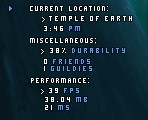
I wonder why the statusbars are so way off. They are basicly empty around 20% like in here:


iradex 03-01-11 06:25 PM

Amazing UI man! I hope you can release it when you finish! I loved the nameplates :D Keep the good work :banana:

Rosoaa 03-01-11 06:42 PM

Quote:

Originally Posted by hankthetank (Post 230902)
I'm working on my UI as well. Some screenshots of finished parts:

Really sick chatbox and nameplates. I've been looking for something like that for allied nameplates. Unfortunately, I don't think it's possible to have different nameplates for allies and enemies. Maybe two different addons?


All times are GMT -6. The time now is 07:04 PM.

vBulletin © 2024, Jelsoft Enterprises Ltd
© 2004 - 2022 MMOUI