UI Feedback Thread
Post screenshots of your UI here, and people can (hopefully!) give you helpful suggestions on what they do/don't like, and how you could make it better! Please keep the posts to fairly large consecutive changes, reposting for every little change you make to the same UI could get tedious ;)
Seerah, feel free to edit this first post to something more official/formal if you wish. |
2 Attachment(s)
I'll start it off! Something I threw together, what do you think? Runic Power is directly behind runes, as you can see in the group shot :D
Ignore the random minimap icon, I was fiddling with an addon xD |
Woot feedback thread!
Ok I know I already put this in the SS thread but, I'm looking for some suggestions for my buffs for this UI. 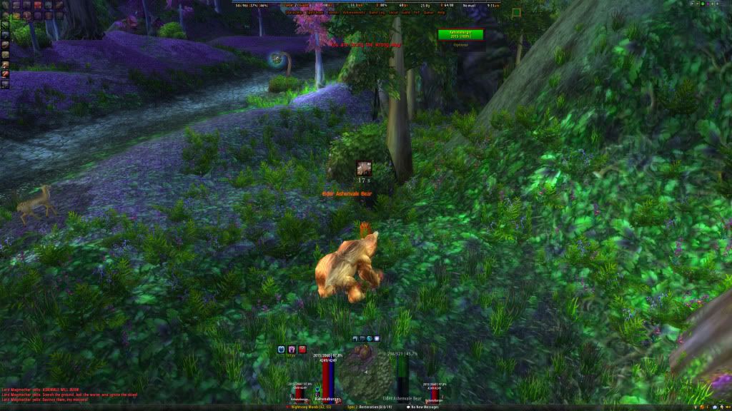 I'm just not happy with them..the debuffs in the center are fine, but the actual buff frame just bugs me, and I haven't found anything I'm with to replace it. |
1 Attachment(s)
fixed the position of the actionbar, looks abit better, made the textures abit darker, looks damn cool, so here is my shammy with tial waves stacks, and water shield :) and thanks Seerah for the tip of align :)
|
Quote:
|
Quote:
|
Quote:
|
Quote:
|
Quote:
|
Quote:
|
Quote:
|
Quote:
|
1 Attachment(s)
I manged to fix it!!!!! yay! what do you think? =)
|
Quote:
|
Quote:
had the border created to "self" and i tried "self.Health" instead, and it worked. :) |
Quote:
One thing I don't like this much is your Recount(?)/Omen. The bars are very colorful and don't fit into the rest of the UI this much in my eyes. Maybe try grey (the same you used for your unit frames) for the bars and the names class colored? I don't know if this is possible with Recount but you could try to make it grow upwards, so that you can put it right next to Omen, even if you are in a smaller group of like 5 people and it then expands upwards if there are more people to show. Hope you get what I mean :) |
1 Attachment(s)
Quote:
|
Quote:
|
Ok twaeked a bit, readjusted here and there and now I think I'm happy with it.
 |
1 Attachment(s)
I have these textures that I cobbled together from Landrells beautiful Tron textures...would there be any interest in them if I uploaded? (All credits to Landrell, of course) And disregard the pink one, i would of course include a desaturated set, so you could color them any way you like~
|
Here is my current UI:
  Any suggestions? |
Quote:
|
Quote:
|
Quote:
And I'm not quite sure on how to change the stack font. |
Quote:
If im not mistaken your ui is his one downloaded and revamped? |
Quote:
|
Quote:
Does your DPS meter need to be gigantic? Do you really care about the debuffs on target? Or are you officer/guildleader/pvp'er? And well I told Haleth the same about the UF's already. I don't really understand why you would want health deficit (basically the important part) transparent. Changing it the other way would make things a lot cleaner imo. Tho as a DPS tha tdoesnt mater much I suppose. Oh and, tell your raid to also buff Might. ;) |
Quote:
I DO like the stylistic point of your UI, Plickz. And if it works well for you in your role, then godspeed. However, Led's advice is grounded, and if you were to ever switch roles or something, then maybe give it a try ;) Good job, though! |
Quote:
I will ;P @Led&Zagrei Thanks for the advice :) edit:: Anyone have any idea how to make it so the names are colored in your chat? When I go on other characters people's names are not class colored and it's really annoying :O. |
Quote:
|
Quote:
|
huzah, thanks!
|
Quote:
|
Quote:
|
Quote:
|
Quote:
I really Like the Tiny Mana Bar too, + the Brighter Class Colours. |
2 Attachment(s)
The whole upper right corner (buffs/stance bar/minimap) seem not to fit...suggestions?
Edit: and apparently the font size for crits seems a tad large, but that's easily corrected. :cool: |
@ Kendian;
Don't use pixel fonts for name texts, you can't properly size them so they'll end up looking bad (like in the screenshots). Tbh I'd just hide your stance bar and key bind it, it's what I do. Use alt + number keys for example. -- I'd like some feedback on mine, been pretty much the same for quite a while now. Not very visible in the screenie but boss frame health changes colour and turns red when it's nearly dead.  |
what can i say Haleth your interfcace is just ..... cant even put it into words (good ofc) :p
|
Wow, very clean & functional interface! Just one thing i would change, one font overall.
greetings nom4k |
Quote:
|
Quote:
Couple things i'd personally change. ■ Hide buffs dps and dps meter in combat ■ Fontflags (monochromed) on : □ UF aura's, □ forte (looks like forte) □ Threatmeter ■ Remove shadow from Msbt ■ Spacing between the icons in the middle. ■ Little less spacing between health and power bars. ■ Border on cd bar ■ Actionbar font as someone already mentioned. -_-V |
Quote:
Quote:
Thanks for the input ^^ @Soxism, not sure I know what you mean by raid bars unless you mean my raid frames, which in that case is Stuf Raid |
@nin's UI...:banana: beautiful!
|
Quote:
|
Quote:
|
Quote:
panels are my own. |
Quote:
|
1 Attachment(s)
been playing around some with altpower bar, how do you guys display this?
not sure if i want it as a bar or just as text. the screenie is showing both atm. http://img141.imageshack.us/i/wowscr...011215352.jpg/ -_-V |
Quote:
|
Quote:
btw what font is that. I saw it in a extremely old UI once of Lyn's or Neals or somebody like that and I haven't been able to find it since. |
Quote:
font is droid serif. |
1 Attachment(s)
What do you think? Leave the backdrop borders white? Or try to use a darker texture? The darker ones dont seem to be as crisp, altho that may just be my comp.
|
To high contrast. Don't do that.
|
Quote:
What don't have enough contrast however are the health and health deficit colors. You can barely tell them apart. edit - I mean for the target frame. At least I think it's target frame. |
Looking for some C&Cs with feedback!
 This is a BG shot to show raid frames and DBM, which still needs to be skinned. I've included three rows of actionbars with 10 buttons to show how it looks with actionbars enabled. I usually have them off though. If there's anybody out there, is it possible to get a 1pixel border on forte? As you can see they have no border it's just the icon. It's no biggy just want to know if it can be done. adding a second screenshot to show my buff / debuff trackers..  See the small squares on the party frames? They're my hot / buff trackers. Earthshield / Riptide / Ancestral Healing etc. |
Currently trying to figure out the optimal display of a spell icon next to a 10:1 statusbar.
Choose one: 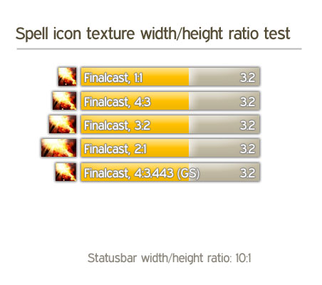 |
4:3 looks really nice...
There's a - theoretically "perfect" - ratio, which is called the "Goldener Schnitt" in German... it's something like 1:1.16... You could try something like this. But as stated before, the 4:3 looks nice and promising! |
Thanks. Updated the picture with the 4 : 3.443 ratio.
|
As long as the icon is designed by blizzard to be 1:1 that definitely looks best. Though the snitzel thing aint that bad either.
The rested stretched ones just look forced. |
| All times are GMT -6. The time now is 01:08 AM. |
vBulletin © 2024, Jelsoft Enterprises Ltd
© 2004 - 2022 MMOUI