WoWInterface

WoWInterface (https://www.wowinterface.com/forums/index.php)
-   UI Screenshots, Feedback and Design Discussion (https://www.wowinterface.com/forums/forumdisplay.php?f=144)
-   -   UI Feedback Thread (https://www.wowinterface.com/forums/showthread.php?t=38749)

eiszeit 02-07-11 10:39 AM

Quote:

Originally Posted by Plickz (Post 228758)
Here is my current UI:

Any suggestions?

What addon is that in the middle of the screen for your debuffs? :O

nin 02-07-11 12:39 PM

Quote:

Originally Posted by Plickz (Post 228758)
[/IMG]
Any suggestions?

All in all it looks good.

Couple things i'd personally change.

■ Hide buffs dps and dps meter in combat
■ Fontflags (monochromed) on :
□ UF aura's,
□ forte (looks like forte)
□ Threatmeter
■ Remove shadow from Msbt
■ Spacing between the icons in the middle.
■ Little less spacing between health and power bars.
■ Border on cd bar
■ Actionbar font as someone already mentioned.

-_-V

Plickz 02-07-11 05:29 PM

Quote:

Originally Posted by eiszeit (Post 228919)
What addon is that in the middle of the screen for your debuffs? :O

That is SBF with a whitelist to only display certain spells.
Quote:

Originally Posted by nin (Post 228928)
All in all it looks good.

Couple things i'd personally change.

■ Hide buffs dps and dps meter in combat
■ Fontflags (monochromed) on :
□ UF aura's,
□ forte (looks like forte)
□ Threatmeter
■ Remove shadow from Msbt
■ Spacing between the icons in the middle.
■ Little less spacing between health and power bars.
■ Border on cd bar
■ Actionbar font as someone already mentioned.

-_-V

I'm not sure on how to add the monochrome to those and removing the shadow from msbt for monochrome appearance. Also I do not know how to fix the actionbar font.

Thanks for the input ^^

@Soxism, not sure I know what you mean by raid bars unless you mean my raid frames, which in that case is Stuf Raid

Aprikot 02-07-11 05:47 PM

@nin's UI...:banana: beautiful!

sakurakira 02-08-11 05:21 AM

Quote:

Originally Posted by Game92 (Post 228732)
I manged to fix it!!!!! yay! what do you think? =)

That inner shadow on everything is really neat looking, nice job!

neverg 02-08-11 06:25 AM

Quote:

Originally Posted by nin (Post 228928)
nin UI.

The Bar on the Bottom you are using my Addon aren't you? Because the disposition is exactly like I wrote mine.

nin 02-08-11 06:40 AM

Quote:

Originally Posted by neverg (Post 228978)
The Bar on the Bottom you are using my Addon aren't you? Because the disposition is exactly like I wrote mine.

I use lumstats yes, you've done such a good job with it :)

panels are my own.

neverg 02-08-11 07:59 AM

Quote:

Originally Posted by nin (Post 228982)
I use lumstats yes, you've done such a good job with it :)

panels are my own.

Was just curious. :]

nin 02-09-11 08:59 AM

1 Attachment(s)
been playing around some with altpower bar, how do you guys display this?

not sure if i want it as a bar or just as text. the screenie is showing both atm.

http://img141.imageshack.us/i/wowscr...011215352.jpg/

-_-V

Aftermathhqt 02-09-11 09:20 AM

Quote:

Originally Posted by nin (Post 229125)
been playing around some with altpower bar, how do you guys display this?

not sure if i want it as a bar or just as text. the screenie is showing both atm.

also trying a new position for castbar.. :P

-_-V

Looks good, i like it, but the castbar all down there? :<

Tejh 02-09-11 12:48 PM

Quote:

Originally Posted by nin (Post 229125)
been playing around some with altpower bar, how do you guys display this?

not sure if i want it as a bar or just as text. the screenie is showing both atm.

also trying a new position for castbar.. :P

-_-V

I feel like text conveys information much better than a graphical representation of it. But both work extremely well, so I would try to find a good place to put the text and keep the bar. I'm not quite sure how a paladins holy power works though, so I can't exactly say how i would do it :P

btw what font is that. I saw it in a extremely old UI once of Lyn's or Neals or somebody like that and I haven't been able to find it since.

nin 02-09-11 01:27 PM

Quote:

Originally Posted by Tejh (Post 229154)
I feel like text conveys information much better than a graphical representation of it. But both work extremely well, so I would try to find a good place to put the text and keep the bar. I'm not quite sure how a paladins holy power works though, so I can't exactly say how i would do it :P

btw what font is that. I saw it in a extremely old UI once of Lyn's or Neals or somebody like that and I haven't been able to find it since.

I have holypower as bars on top of my UF, i think im going for bars. might just have text on raidframes. will see how it works out. :)

font is droid serif.

Kendian 02-09-11 02:30 PM

1 Attachment(s)
What do you think? Leave the backdrop borders white? Or try to use a darker texture? The darker ones dont seem to be as crisp, altho that may just be my comp.

zork 02-10-11 01:55 AM

To high contrast. Don't do that.

haylie 02-10-11 08:41 AM

Quote:

Originally Posted by Kendian (Post 229179)
What do you think? Leave the backdrop borders white? Or try to use a darker texture? The darker ones dont seem to be as crisp, altho that may just be my comp.

Like zork said, too much contrast. The white borders distract attention away from the actual content of the panels and unit frames.

What don't have enough contrast however are the health and health deficit colors. You can barely tell them apart.

edit - I mean for the target frame. At least I think it's target frame.

Krase 02-10-11 01:55 PM

Looking for some C&Cs with feedback!


This is a BG shot to show raid frames and DBM, which still needs to be skinned.
I've included three rows of actionbars with 10 buttons to show how it looks with actionbars enabled. I usually have them off though.

If there's anybody out there, is it possible to get a 1pixel border on forte? As you can see they have no border it's just the icon. It's no biggy just want to know if it can be done.

adding a second screenshot to show my buff / debuff trackers..


See the small squares on the party frames? They're my hot / buff trackers. Earthshield / Riptide / Ancestral Healing etc.

zork 02-11-11 05:56 AM

Currently trying to figure out the optimal display of a spell icon next to a 10:1 statusbar.

Choose one:

Mischback 02-11-11 06:39 AM

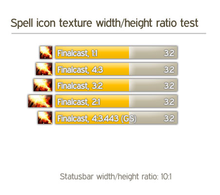
4:3 looks really nice...

There's a - theoretically "perfect" - ratio, which is called the "Goldener Schnitt" in German... it's something like 1:1.16... You could try something like this.

But as stated before, the 4:3 looks nice and promising!

zork 02-11-11 07:03 AM

Thanks. Updated the picture with the 4 : 3.443 ratio.

sacrife 02-11-11 07:37 AM

As long as the icon is designed by blizzard to be 1:1 that definitely looks best. Though the snitzel thing aint that bad either.

The rested stretched ones just look forced.


All times are GMT -6. The time now is 05:49 AM.

vBulletin © 2024, Jelsoft Enterprises Ltd
© 2004 - 2022 MMOUI