WoWInterface

WoWInterface (https://www.wowinterface.com/forums/index.php)
-   AddOn Search/Requests (https://www.wowinterface.com/forums/forumdisplay.php?f=6)
-   -   My UI, Suggestions please (https://www.wowinterface.com/forums/showthread.php?t=33433)

MiniStew 06-24-10 01:50 PM

My UI, Suggestions please
 
Hey everyone who reads this :)

This is My compilation UI I made. It's only for myself because I don't think people would be interested in it. The resolution is 1024x768 because it's on my laptop and my Desktop is broke atm but I could have more resolutions if I made it public. Any suggestions on how to make it better or anything. Could you rate it out of 10 also? Thanks.
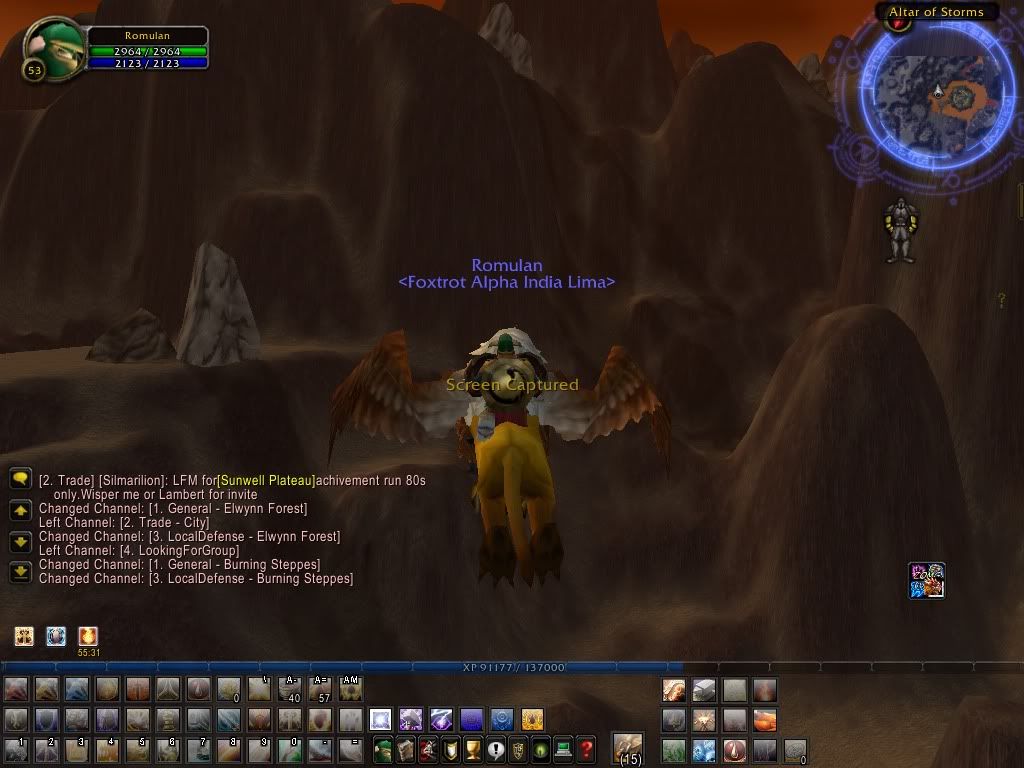

MiniStew 06-24-10 02:39 PM

Quote:

Originally Posted by Jav (Post 194085)
1/10

Xp bar is huge and in the way and overall looks a bit plain.

Thanks for the reply. The XP bar is default size, I want it that way for myself and anybody can change the size of it. It's intended to be minimalistic, so I guess plain is a compliment even though it wasn't intended to be.

MiniStew 06-24-10 03:51 PM

thanks didn't know that :banana:

Wella 06-24-10 04:50 PM

If you manage to stick with it until level 80 and it doesn't stop you from playing well, then there's nothing wrong with this UI (except if you plan to release it). However, I'm sure you want people to comment on it from their point of view, so I'll be straight with you.

You obviously haven't made a UI before. How do I know this? You are using about five (visible) addons and you've barely done anything with each of them. Here are the first few things I would do to that UI to start it off:

1. Get rid of SexyMap or at least use a less distracting border. It's completely unnecessary.
2. Sort out your action bars - get rid of all that gloss, make things across a maximum of two bars and get rid of the buttons which you don't need, because I'm sure you don't need all of those buttons shown all the time - you could make certain bars show when you're in or out of combat, or only when you hover over them. (Along with sorting out your action bars, make your XP bar fit into them, rather than sitting on top of them. Try putting it right at the bottom of your screen.)
3. Play with Satrina Buff Frames more - this addon is fantastic and has a lot of opportunity for you to do great things with it. Start off with some basic customization, such as adding a frame which only shows your debuffs on the target, then keep going with filters, layouts, skinning with ButtonFacade, etc. Auras are a hugely important part of your interface!
4. (Optional) Start messing around with the chat box - get a fairly simple chat addon (there are loads to choose from) to start off with and mess around with it.

Good luck and happy gaming!

MiniStew 06-25-10 03:46 AM

Quote:

Originally Posted by Wella (Post 194134)
If you manage to stick with it until level 80 and it doesn't stop you from playing well, then there's nothing wrong with this UI (except if you plan to release it). However, I'm sure you want people to comment on it from their point of view, so I'll be straight with you.

You obviously haven't made a UI before. How do I know this? You are using about five (visible) addons and you've barely done anything with each of them. Here are the first few things I would do to that UI to start it off:

1. Get rid of SexyMap or at least use a less distracting border. It's completely unnecessary.
2. Sort out your action bars - get rid of all that gloss, make things across a maximum of two bars and get rid of the buttons which you don't need, because I'm sure you don't need all of those buttons shown all the time - you could make certain bars show when you're in or out of combat, or only when you hover over them. (Along with sorting out your action bars, make your XP bar fit into them, rather than sitting on top of them. Try putting it right at the bottom of your screen.)
3. Play with Satrina Buff Frames more - this addon is fantastic and has a lot of opportunity for you to do great things with it. Start off with some basic customization, such as adding a frame which only shows your debuffs on the target, then keep going with filters, layouts, skinning with ButtonFacade, etc. Auras are a hugely important part of your interface!
4. (Optional) Start messing around with the chat box - get a fairly simple chat addon (there are loads to choose from) to start off with and mess around with it.

Good luck and happy gaming!

Thanks for the info. I was using a less distracting border before but it went back to default by accident and I forgot to change it. Other than that thanks for the time consumed reply which you wrote :)

SuranthianH3 06-25-10 05:35 AM

I play at a 1280x800 resolution on a laptop, so coming up with a good UI can take some time. :P

Well here is a screenshot of my work in progress with explanations below it.
I suggest going for a compact UI, I really suggest getting Dominos above all else, though, it will help make it look a lot better. The low damage is part my crap gear and part carbonite putting my fps at 0.5-2 (I had to drop out of a heroic to investigate the issue). I usually pull 2.5k-4k dps :P


The artwork is an addon called Sunn Viewport which allows resizing the render frame (the actual object that creatures, nameplates, etc. are drawn on), but that usually just leaves black under the UI elements instead of the world, which is what Sunn Viewport fixes by added various artwork under the UI. It also makes your UI looks a lot nicer. Just install different packs. I got mine here

The actionbar addon is Dominos, it hasn't failed me yet.

The unitframes are Pitbull (Which are HEAVILY modified by me to suit what I want)

The nameplates are Tidyplates: Threatplates

The meters beside the bars are Omen (Left; threat meter) and Recount (Right; damage meter)

The circular bars and the rune bar next to my actionbars is IceHUD.

The minimap isn't what I usually use, Carbonite is bugged and when I use it it lags me a lot in combat, so until then I have to use the default. XD

The buff and debuff bars are Simple Buff Bars.

The battle text going around IceHUD is Miks Scrolling Battle Text, which is very useful for procs and managing "number spam" when AoEing.

If you have any other questions, feel free to message or reply.

MiniStew 06-25-10 02:49 PM

Quote:

Originally Posted by SuranthianH3 (Post 194264)
I play at a 1280x800 resolution on a laptop, so coming up with a good UI can take some time. :P

Well here is a screenshot of my work in progress with explanations below it.
I suggest going for a compact UI, I really suggest getting Dominos above all else, though, it will help make it look a lot better. The low damage is part my crap gear and part carbonite putting my fps at 0.5-2 (I had to drop out of a heroic to investigate the issue). I usually pull 2.5k-4k dps :P


The artwork is an addon called Sunn Viewport which allows resizing the render frame (the actual object that creatures, nameplates, etc. are drawn on), but that usually just leaves black under the UI elements instead of the world, which is what Sunn Viewport fixes by added various artwork under the UI. It also makes your UI looks a lot nicer. Just install different packs. I got mine here

The actionbar addon is Dominos, it hasn't failed me yet.

The unitframes are Pitbull (Which are HEAVILY modified by me to suit what I want)

The nameplates are Tidyplates: Threatplates

The meters beside the bars are Omen (Left; threat meter) and Recount (Right; damage meter)

The circular bars and the rune bar next to my actionbars is IceHUD.

The minimap isn't what I usually use, Carbonite is bugged and when I use it it lags me a lot in combat, so until then I have to use the default. XD

The buff and debuff bars are Simple Buff Bars.

The battle text going around IceHUD is Miks Scrolling Battle Text, which is very useful for procs and managing "number spam" when AoEing.

If you have any other questions, feel free to message or reply.

Thanks so much for this reply it's helping me alot. Thanks for the info about IceHUD and MSBT. I used MSBT ages ago and loved it but forgot what it was called after reinstalling wow. Can I add you for future questions.

blkdrgn 06-25-10 03:23 PM

Quote:

Originally Posted by SuranthianH3 (Post 194264)
I play at a 1280x800 resolution on a laptop, so coming up with a good UI can take some time. :P

Well here is a screenshot of my work in progress with explanations below it.
I suggest going for a compact UI, I really suggest getting Dominos above all else, though, it will help make it look a lot better. The low damage is part my crap gear and part carbonite putting my fps at 0.5-2 (I had to drop out of a heroic to investigate the issue). I usually pull 2.5k-4k dps :P


The artwork is an addon called Sunn Viewport which allows resizing the render frame (the actual object that creatures, nameplates, etc. are drawn on), but that usually just leaves black under the UI elements instead of the world, which is what Sunn Viewport fixes by added various artwork under the UI. It also makes your UI looks a lot nicer. Just install different packs. I got mine here

The actionbar addon is Dominos, it hasn't failed me yet.

The unitframes are Pitbull (Which are HEAVILY modified by me to suit what I want)

The nameplates are Tidyplates: Threatplates

The meters beside the bars are Omen (Left; threat meter) and Recount (Right; damage meter)

The circular bars and the rune bar next to my actionbars is IceHUD.

The minimap isn't what I usually use, Carbonite is bugged and when I use it it lags me a lot in combat, so until then I have to use the default. XD

The buff and debuff bars are Simple Buff Bars.

The battle text going around IceHUD is Miks Scrolling Battle Text, which is very useful for procs and managing "number spam" when AoEing.

If you have any other questions, feel free to message or reply.

If you shrunk omen and recount, to fit inside one of your boxes, then moved the chat into the other one....that ui would look 80% better.

But that is just one opinion.

SuranthianH3 06-25-10 10:15 PM

Quote:

Originally Posted by blkdrgn (Post 194390)
If you shrunk omen and recount, to fit inside one of your boxes, then moved the chat into the other one....that ui would look 80% better.

But that is just one opinion.

Yeah I actually DID do that after I posted. I moved omen and recount to the right and put the chat in the left. I also took the bag bar and main menu and put it along the left side to allow for more room for the meters and to efficiently use the sidespace. This further proves the other guys point that it takes alot of playing around with your UI to finally be happy with it. I'll post a screeny of the current one in a bit.

Quote:

Originally Posted by MiniStew (Post 194387)
Thanks so much for this reply it's helping me alot. Thanks for the info about IceHUD and MSBT. I used MSBT ages ago and loved it but forgot what it was called after reinstalling wow. Can I add you for future questions.

Sure man, go ahead.

New UI Screenshot:


All times are GMT -6. The time now is 08:59 AM.

vBulletin © 2024, Jelsoft Enterprises Ltd
© 2004 - 2022 MMOUI