Buff indicators
So far nUi has been an excellent design. I liked the way every thing was focused on the bottom of the screen.
In the new release the buff indicators have now been changed to grow upwards on the sides rather than along the bottom of the screen. Contrary to the original design. I can see that some may feel the need to have this option, but in my case it now interferes with every thing else I have on the screen. Is it possible to give the option for buffs along the bottom or along the side? |
An optional plugin is forthcoming for that purpose... I guess I'm going to have to consider stepping the priority up on that.
|
I would like to second that. I love NUI, and the changes in the with 5.0 seem great, but the buff change is a killer for me.
|
Let me point out here, as well, the '/nui maxauras {n}' slash command... you can use it to limit how many auras are being displayed. I'll see if I can't get the other plugin out in the next day or two.
|
Quote:
I agree, the new aura bars allow for a lot more functionality, both now and in the future. But for me I don't interact with my buffs as much as I need a highly compact way to see and know what is and is not there, quick and painless. I can't say my needs match those of everyone else who uses nUI, but I do know that the old positioning of the buffs really helped me both in maximizing screen space and reducing clutter, the two things nUI has always excelled at. To actually reply, using the /nui maxauras # to limit the count doesn't help me because I need to see all the buffs active, and the screen space that requires is simply too great in a full raid. To wrap up on a positive note, thank you again for all the development and effort you have put into nUI. I love the mod, and hope to continue to support and enjoy it in the future. (And one of these days I'll actually post my Carbonite addon to it) |
I have to agree.
There is so much in this UI that I absolutely love. However the handling of buffs and debuffs makes it so I can not raid. I simply can not use the UI as the aura handling stands. In basic blizz ui, I can see the difference via location of buffs and debuffs. All the text for the various auras takes way too much screen. In Naxx 25 as an example, the aura bar for the targeted boss would scroll off the screen and be filled with so much information it was unusable. All the target info I need is already on the HUD. On my buff side, between me and my pet the bar was going off the screen as well. To me the basic blizzard bars is all I need, with maybe a way to relocate them. Besides that, I really love this nUI+, but until the aura area is addressed, I won't be able to use it.
|
Have you looked at the nUI Aura Buttons plugin?
http://www.wowinterface.com/download...raButtons.html EDIT: I might add that setting '/nui maxauras 0' would disable the built in aura buttons and then allow the hard core raider to use something like Crystal or Elk and all their bells and whistles until such time as I can improve nUI's own aura flexibility. |
is there possible to get the debuffs moved? pretty anoying if im rading 25 man thaddius and i cant see the little + or -, spot in my mind is under HP/mana HUD, just above pet bar
|
Ummm... I actually have no idea what you're talking about here...
what +/- ? where? huh? |
I think Zangband is referring to the buff/debuff that gives your character a Negative or Positive charge on a boss. When that happens you have to group with like charged players or chaos ensues :)
*Edit -- Example spell link http://www.wowhead.com/?spell=39088 |
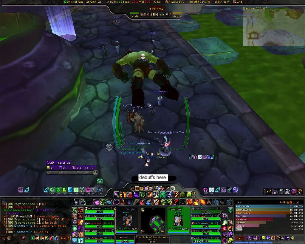 Debuffs shows on player frame atm, and it is a little hard to see what debuffs you got on you and it only shows 1-3 debuffs Quote:
|
From the look of that, I'm assuming that you've removed the HUD that's built into nUI and replaced it with another third party HUD. Unfortunately, the debuffs you're looking for are displayed in nUI's HUD. That's why you're not seeing the debuffs and since you removed the built in HUD, there's really nothing I can do about that.
nUI does not show any debuffs in the space you highlighted, that's normally where it would print the range if you were using the built in HUD, so I have no idea what is being displayed there or by what mod. |
Quote:
*Edited* is there possible to have cooldown icons and the text on top of eachother? little cluttery the way it is now. Quote:
|
Quote:
Edit: The debuff-placing to the middle-left of the Hud fits perfectly as far as a quick overview is concerned. |
| All times are GMT -6. The time now is 05:41 AM. |
vBulletin © 2024, Jelsoft Enterprises Ltd
© 2004 - 2022 MMOUI