Originally Posted by Rosoaa

Tell what you guys think.
Tried to do something like this UI: http://www.youtube.com/watch?v=68siAqFIU6w

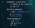
I suggest zooming in on that pic it looks blurry. That light blue arrow will collapse/expand all the text.
______________________________________________________________________
Which is better? The first UF or the second two?
 |
The second. Reason being (for me), is you already have a BG shadow, the front overlay texture doesn't need the shadow. Just my opinion, of course, they're both lovely.

Oh, and if you could give me a clue about how to streamline the collapse/expanding script for KGPanels, and how you did it with an invisible texture (the arrow is the texture?) I'd appreciate it. My collapse/expand scripting is positively ANCIENT, and needs 3 panels, at the very least.