Tell what you guys think.
Tried to do something like this UI:
http://www.youtube.com/watch?v=68siAqFIU6w
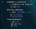
I suggest zooming in on that pic it looks blurry. That light blue arrow will collapse/expand all the text.
______________________________________________________________________
Which is better? The first UF or the second two?
