Thread Tools Display Modes
02-22-11, 02:36 PM   #161
nin
A Cobalt Mageweaver
AddOn Author - Click to view addons
Join Date: Dec 2008
Posts: 213
Originally Posted by Kendian View Post
Trying to decide on a UF, but cant get it exactly right, and its driving me crazy, lol. The first is what I've been using, the second is a variation of it, and third is split player UF, with a centered target UF. SOMETHING is not quite right about ANY of them, but can't put my finger on it, which causes me to stand around, adjust /rl, stand around, adjust, /rl, ad infinitum.
Suggestions PLEASE, lol.
I like # 3 the most. Though it looks very unfinished too me.. your problem is probably that you make a lot of pretty big changes very often, wich one do you feel most comfortable with?

wich one makes you able too track important stuff easiest?

I always start working on how i want it for best performance at first (how i track cd's debuffs,buffs, healing(in my case) etc) , when im happy with that i try too make things look clean :P

The dark brownish (looks brownish for me but i guess its a darker classcolor?) would look better if you made it either brighter or just a subtle grayish/dark tone.

Last edited by nin : 02-22-11 at 02:38 PM.
 
02-22-11, 08:11 PM   #162
Desu
A Defias Bandit
Join Date: Aug 2009
Posts: 3
Originally Posted by Mischback View Post
@Desu
I would never mind to play with something like that, but damn, this is really sexy!
On my first look I could not stand the bright borders, but it looks really cool. Please, make your nameplates fitting and this would be a real cool interface!
Thanks!
I worked on a similar layout on and off for about 4 months. Started to feel a bit clogged, so I scrapped everything, save the UFs and panels. This is the result. I think you're right about the borders/backdrop though, the contrast is a bit too much. The backdrop on the totembars are a bit more easy on the eyes, I think I'll use something similar on the rest of the UI.

Originally Posted by sakurakira View Post
Desu - Since you've moved your minimap, you should get a buff addon that will let you move your buffs. You will have more space to work with and there won't be an odd looking blank space where the map used to be.
I agree. I'll experiment some to see what would look best, bars or icons.

Thanks for the feedback, I'll get back with some updates once I find a suitable layout for my buffs.

-------------------Edit--------------------
Originally Posted by Rej View Post
UI i've been working on.. i dont know what it is, but im not happy about something with it... any criticism is greatly appreciated.
I like your layout with the player frame in the bottom, then actionbars and lastly target frame with timers on top. I've used a somewhat similar layout for a while myself. The one thing that stands out the most, as others have already stated, is the width of your actionbar. It'd look better if it was the same width as the rest.
Another thing that could use change is your shape bar, it kinda ruins the symmetry.

Also, may I recommend a tooltip addon? Tiptac is great.

Last edited by Desu : 02-22-11 at 08:45 PM.
 
02-23-11, 03:41 AM   #163
iljott
A Rage Talon Dragon Guard
 
iljott's Avatar
Join Date: Apr 2005
Posts: 335
Originally Posted by strykerk View Post
Current UI setup with a combat raid shot.
What UI is that Strykerk? Is it available for download please?
 
02-23-11, 07:46 PM   #164
strykerk
A Deviate Faerie Dragon
 
strykerk's Avatar
Join Date: Nov 2010
Posts: 19
Originally Posted by iljott View Post
What UI is that Strykerk? Is it available for download please?
It is my own UI. It is currently not available for download. (sorry)
 
02-24-11, 12:44 AM   #165
iljott
A Rage Talon Dragon Guard
 
iljott's Avatar
Join Date: Apr 2005
Posts: 335
Originally Posted by strykerk View Post
It is my own UI. It is currently not available for download. (sorry)
That's too bad. I was looking for a nice setup such as yours - clean, but with enough info at your fingertips! Do you have any pointers as how to go about making my own such as what addons you used to create it, etc?
 
02-24-11, 03:37 AM   #166
Aftermathhqt
A Molten Giant
 
Aftermathhqt's Avatar
AddOn Author - Click to view addons
Join Date: Dec 2009
Posts: 784
what do you think? ^_^ and aftermathhUI is done ;>
Attached Thumbnails
Click image for larger version

Name:	WoWScrnShot_022411_103637.jpg
Views:	783
Size:	1.95 MB
ID:	5793  
 
02-24-11, 04:01 AM   #167
zork
A Pyroguard Emberseer
 
zork's Avatar
AddOn Author - Click to view addons
Join Date: Jul 2008
Posts: 1,740
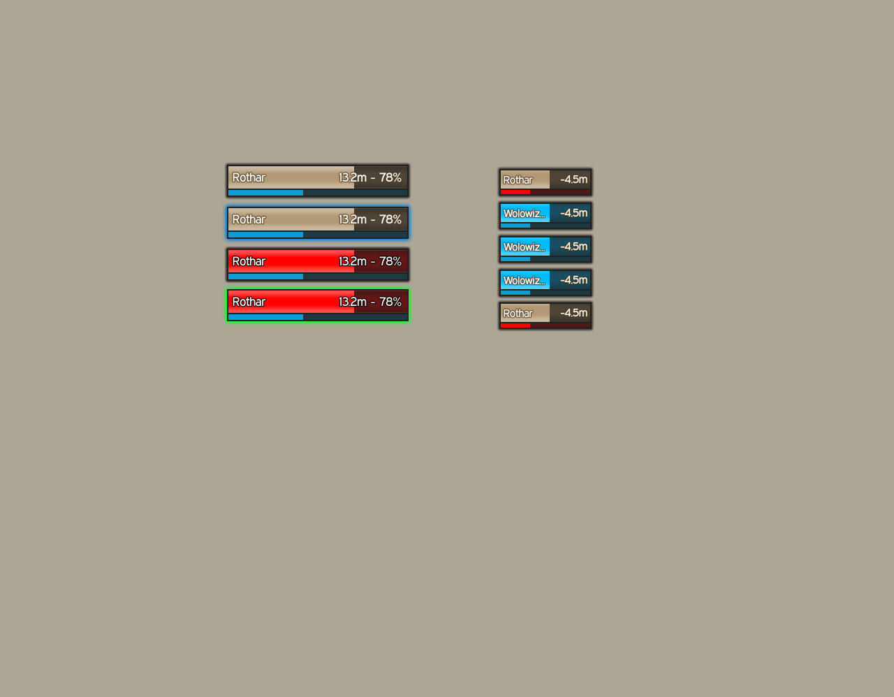
I near future I'm planning to update my oUF_Simple layout again.

Currently tinkering with some ideas:


But I need some help. I want raidframe that keep the look sort of consistent but on the same time are capable of displaying debuff icons inside the frame.

Maybe anyone has a good idea.

Healthbars are 8:1, Powerbars are 32:1. Party frames are scaled down by 0.85 and only use half the width of the the normal frames.

Read health = Aggro, Outer glow = debuff highlight.

@Game92
I like it but a bit too much shadow heavy for my taste.
__________________
| Simple is beautiful.
| WoWI AddOns | GitHub | Zork (WoW)

"I wonder what the non-pathetic people are doing tonight?" - Rajesh Koothrappali (The Big Bang Theory)

Last edited by zork : 02-24-11 at 04:04 AM.
 
02-24-11, 04:53 AM   #168
Aftermathhqt
A Molten Giant
 
Aftermathhqt's Avatar
AddOn Author - Click to view addons
Join Date: Dec 2009
Posts: 784
Originally Posted by zork View Post
I near future I'm planning to update my oUF_Simple layout again.

Currently tinkering with some ideas:


But I need some help. I want raidframe that keep the look sort of consistent but on the same time are capable of displaying debuff icons inside the frame.

Maybe anyone has a good idea.

Healthbars are 8:1, Powerbars are 32:1. Party frames are scaled down by 0.85 and only use half the width of the the normal frames.

Read health = Aggro, Outer glow = debuff highlight.

@Game92
I like it but a bit too much shadow heavy for my taste.
Looks great, zork, if you get taht debuff highlight code to work, i would like to have it O.O looks cool and its the only thing i really miss on my oUF layout, to track debuff highlight easier. and thanks
 
02-24-11, 05:19 AM   #169
nin
A Cobalt Mageweaver
AddOn Author - Click to view addons
Join Date: Dec 2008
Posts: 213
Originally Posted by zork View Post
But I need some help. I want raidframe that keep the look sort of consistent but on the same time are capable of displaying debuff icons inside the frame.
My layout looks pretty similar too that, i only do pve and i only heal. so raidframes are the ones i pay most attention too and for me these works absolutetly great, though for pvp i would probably remake them because people have debuffs on them a lot more than in pve.

I color the border on aggro aswell..

http://img338.imageshack.us/f/wowscr...911232457.jpg/

In this vid you can see how i also track important buff's with my raidframes.

http://vimeo.com/20245012

Looking forward seeing your end result!

-_-V
 
02-24-11, 06:52 AM   #170
Kendian
A Molten Giant
 
Kendian's Avatar
AddOn Author - Click to view addons
Join Date: Mar 2010
Posts: 614
A nearly finished product, imo. (FINALLY) This is alot like what I had pre- Cata, but with some tweaks. Comments/C&C, please.

@Game92:It's very nice, a tad cluttered, but very smooth.

@Zork: I would LOVE for you to update your oUF Simple AND the tutorial.
Aside from that, I MISS your oUF Diablo Raid frames as a standalone...I used that without anything else from RothUI forever, or at least until the patches pre- Cata broke them . Any way, I can't wait for the update, everything you do is simple clean, and just plain sexy~
Attached Thumbnails
Click image for larger version

Name:	Idle.jpg
Views:	698
Size:	1.51 MB
ID:	5794  Click image for larger version

Name:	Combat.jpg
Views:	699
Size:	1.49 MB
ID:	5795  
__________________

Last edited by Kendian : 02-24-11 at 07:00 AM. Reason: Spellcheck =)
 
02-24-11, 06:59 AM   #171
Kendian
A Molten Giant
 
Kendian's Avatar
AddOn Author - Click to view addons
Join Date: Mar 2010
Posts: 614
@nin: Gosh DAMN, thats pretty! I'm not usually a convert but that vid
was
SEXXYYY!!
__________________
 
02-24-11, 07:24 AM   #172
zork
A Pyroguard Emberseer
 
zork's Avatar
AddOn Author - Click to view addons
Join Date: Jul 2008
Posts: 1,740
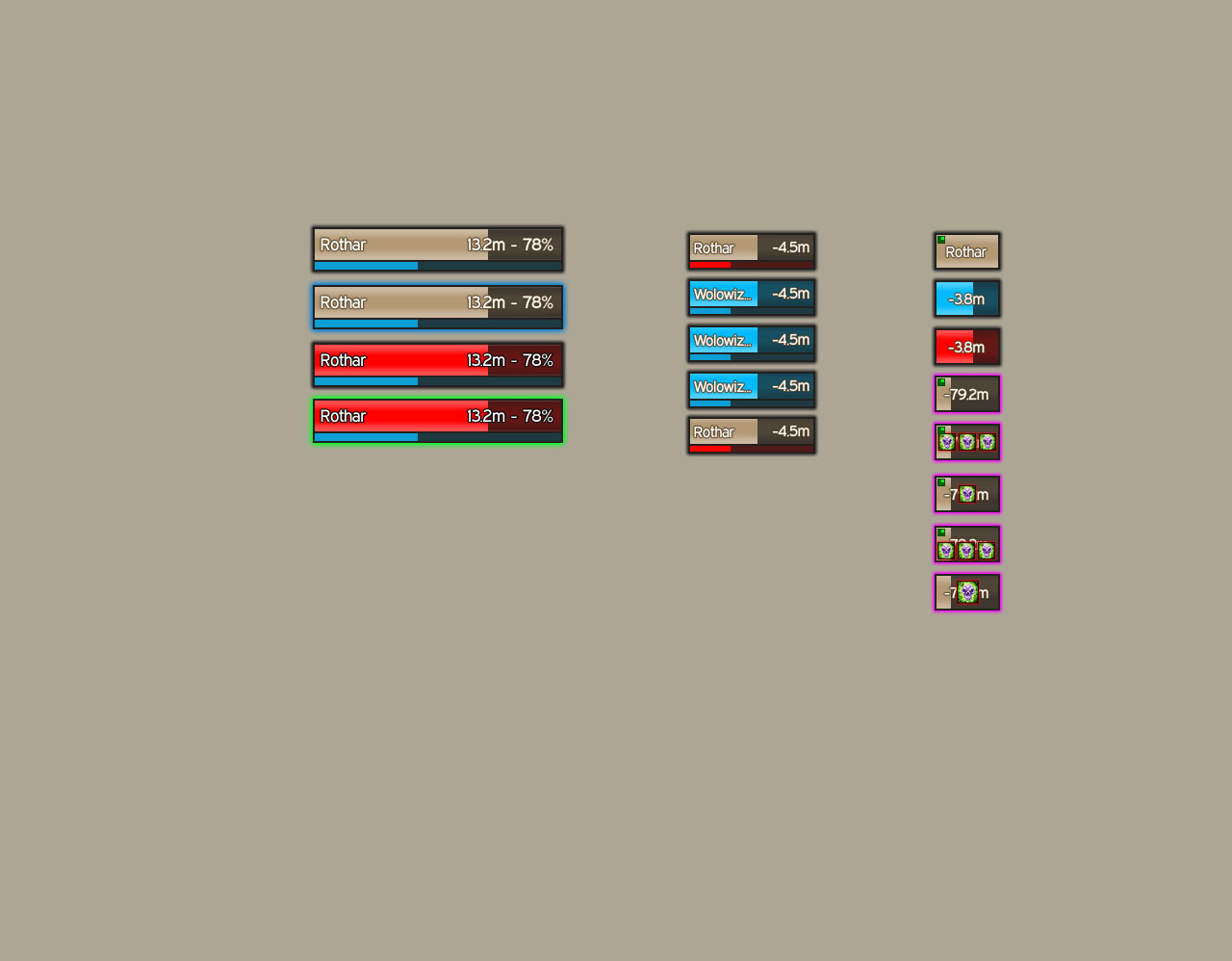
Thanks nin. Some attempts on debuff icons on raid frames.


To bad I think I need to stick with the "one icon only" solution. Otherwise idicators for hots and other buffs will be hard to place.

Even with only "one" icon the health text gets impossible to read.

@Kendian
I like it, for obious reasons.
__________________
| Simple is beautiful.
| WoWI AddOns | GitHub | Zork (WoW)

"I wonder what the non-pathetic people are doing tonight?" - Rajesh Koothrappali (The Big Bang Theory)

Last edited by zork : 02-24-11 at 07:26 AM.
 
02-24-11, 07:47 AM   #173
Petrah
A Pyroguard Emberseer
 
Petrah's Avatar
AddOn Author - Click to view addons
Join Date: Jan 2008
Posts: 2,988
Originally Posted by Game92 View Post
what do you think? ^_^ and aftermathhUI is done ;>

Nice looking UI! About the only thing I would change are the sizes of the unit frames (too large), and I would remove the buffs'/debuffs and portraits on the party frames (too much unnecessary info). It kinda feels like the unit frames are eating the majority of the screen real estate.

I've never been a big fan of beautycase, but that appears to be the overall focus of your design. It's still a very nice looking UI!
__________________
♪~ ( ) I My Sonos!
AddOn Authors: If your addon spams the chat box with "Addon v8.3.4.5.3 now loaded!", please add an option to disable it!

Last edited by Petrah : 02-24-11 at 07:50 AM.
 
02-24-11, 08:22 AM   #174
nin
A Cobalt Mageweaver
AddOn Author - Click to view addons
Join Date: Dec 2008
Posts: 213
Originally Posted by zork View Post
Even with only "one" icon the health text gets impossible to read.
I've been trying a gazillion ways too display icons, because they do sometimes take up a lot of space, i don't find it much of a problem in pve since i set it up so what i see as icons in pve i need too pay attention too.

If i was into pvp i would probably remove the icons on the "less" important stuff and just have the backdrop show.

I use gradient coloring just because i can track hp easier when icons are up, and honestly i don't think icon covering the health text is that much of a problem.

If you really want too see the health text you could try put a hp textstring that show's when you have icons with maybe a smaller font and in one of the UF's corners.. though it will most likely take the precious space for corner indicators :P

Good luck! :>

Originally Posted by Game92 View Post
what do you think? ^_^ and aftermathhUI is done ;>
Like some mentioned, your Uf's are huge, the party frames takes up a lot of space, other than that it's pretty smooth. not a fan of the powerbar's though :>

@Kendian

Thanks :P

Latest screenies looks great!

Last edited by nin : 02-24-11 at 08:49 AM.
 
02-24-11, 09:36 AM   #175
Aftermathhqt
A Molten Giant
 
Aftermathhqt's Avatar
AddOn Author - Click to view addons
Join Date: Dec 2009
Posts: 784
Originally Posted by Petrah View Post
Nice looking UI! About the only thing I would change are the sizes of the unit frames (too large), and I would remove the buffs'/debuffs and portraits on the party frames (too much unnecessary info). It kinda feels like the unit frames are eating the majority of the screen real estate.

I've never been a big fan of beautycase, but that appears to be the overall focus of your design. It's still a very nice looking UI!
Thanks and that's boss frames ;> yeah, maybe they do.. i don't know im so use too it, i guess ^^ it does the hole design and you can change textures yours that you prefer very easy, going abit offtopic but yeah ;>

Originally Posted by nin View Post
I've been trying a gazillion ways too display icons, because they do sometimes take up a lot of space, i don't find it much of a problem in pve since i set it up so what i see as icons in pve i need too pay attention too.

If i was into pvp i would probably remove the icons on the "less" important stuff and just have the backdrop show.

I use gradient coloring just because i can track hp easier when icons are up, and honestly i don't think icon covering the health text is that much of a problem.

If you really want too see the health text you could try put a hp textstring that show's when you have icons with maybe a smaller font and in one of the UF's corners.. though it will most likely take the precious space for corner indicators :P

Good luck! :>

Like some mentioned, your Uf's are huge, the party frames takes up a lot of space, other than that it's pretty smooth. not a fan of the powerbar's though :>

@Kendian

Thanks :P

Latest screenies looks great!
Yeah, indeed, but im pretty used to it, so ^^ hehe, its boss frames
I don't know if like it myself, atm just trying it out, and see if i like it btw, are you thinking of uploading your UI? I really like to try it out ^^

Last edited by Aftermathhqt : 02-24-11 at 09:39 AM.
 
02-24-11, 09:50 AM   #176
Dawn
A Molten Giant
 
Dawn's Avatar
AddOn Author - Click to view addons
Join Date: May 2006
Posts: 918
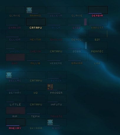
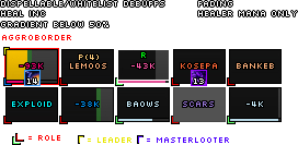
Raidframes can be a bitch. Finding the "perfect" (for me) solution is my personal Q since implementing raidframes into my first oUF layout.

The tricky part is keeping them clean while still showing important information in a damn tiny little space.

Some basic things I came up with that work for me:
1) hp needs to have a certain minimum size, not to small, ~64 width * 22-32 height
2) either display power or don't, if you do, hide non mana power bars, shorten the power bar (~width or height * 0.7) and put it on top of the health bar (either vertical or horizontally)
3) show certain information on mouseover, e.g. exact health values, leader/master looter indicator...
4) filter auras
5) make use of the healthbar frame's edges to slightly extend the avialable space beyond the actual frame size
and/or
create a virtual second "bar" that holds information - it doesn't necessarily needs to be visible in any way at all, spacing between raid units would do it already
6) non class colored health frames are actually more handy, since they allow for less eye distraction when you put a lot of information onto hp and allow for threat highlight on top of the health (or coloring health by threat)
7) buff indicators either by text (like "R" for renew) or by different colored DOTs

I'd Photoshop some example, but I have non available at this PC so I just copy&paste a picture. Something like that ...


Threat is shown as a gradient overlay on the health, debuff highlight = border

or without power

background of info panel is colored by debuff, threat is once again overlay on top of the health bar ... borders could have been used aswell

E: photoshop'ed example added
Attached Thumbnails
Click image for larger version

Name:	raidframe layout wip.png
Views:	704
Size:	7.3 KB
ID:	5796  
__________________
Rock: "We're sub-standard DPS. Nerf Paper, Scissors are fine."
Paper: "OMG, WTF, Scissors!"
Scissors: "Rock is OP and Paper are QQers. We need PvP buffs."

"neeh the game wont be remembered as the game who made blizz the most money, it will be remembered as the game who had the most QQ'ers that just couldnt quit the game for some reason..."


Last edited by Dawn : 02-24-11 at 06:41 PM. Reason: added shop'ed example
 
02-25-11, 03:34 AM   #177
zynix
A Cliff Giant
AddOn Author - Click to view addons
Join Date: May 2008
Posts: 70
Originally Posted by Dawn View Post
Raidframes can be a bitch. Finding the "perfect" (for me) solution is my personal Q since implementing raidframes into my first oUF layout.

E: photoshop'ed example added
Oooooh, I like those photoshopped ones!
I think you pulled it off quite nicely. Able to see text, with debuffs, and still have 4 buff indicators in the corners, and having a color gradient for health.

Good job!
 
02-25-11, 05:07 AM   #178
sacrife
An Onyxian Warder
 
sacrife's Avatar
AddOn Author - Click to view addons
Join Date: Mar 2009
Posts: 384
Originally Posted by zynix View Post
Oooooh, I like those photoshopped ones!
I think you pulled it off quite nicely. Able to see text, with debuffs, and still have 4 buff indicators in the corners, and having a color gradient for health.

Good job!
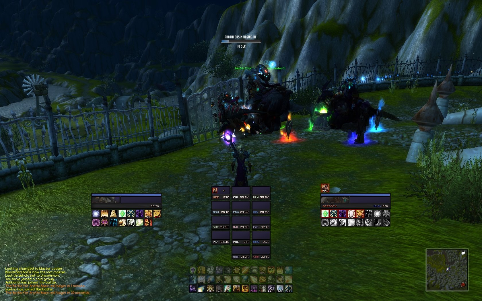
This is how I did it, works very well

__________________

 
02-25-11, 07:36 AM   #179
Petrah
A Pyroguard Emberseer
 
Petrah's Avatar
AddOn Author - Click to view addons
Join Date: Jan 2008
Posts: 2,988
Originally Posted by Dawn View Post
Now see, those unit frames are so sexy that one almost needs a cold shower after viewing them!

Seriously, I have always been a huge fan of your UF's. /nods
__________________
♪~ ( ) I My Sonos!
AddOn Authors: If your addon spams the chat box with "Addon v8.3.4.5.3 now loaded!", please add an option to disable it!
 
02-25-11, 03:54 PM   #180
Oraknathal
A Flamescale Wyrmkin
 
Oraknathal's Avatar
Join Date: Sep 2010
Posts: 143
Originally Posted by sacrife View Post
This is how I did it, works very well

what font is that and where cna i get it?
 

WoWInterface » AddOns, Compilations, Macros » UI Screenshots, Feedback and Design Discussion » UI Feedback Thread


Posting Rules
You may not post new threads
You may not post replies
You may not post attachments
You may not edit your posts

vB code is On
Smilies are On
[IMG] code is On
HTML code is Off