| 03-07-20, 08:18 AM | #1 |
|
Scorpio.UI - a new ui & skin system
After spending two years on web project with Openresty, finally I got time and the new ideas for the Scorpio lib's UI part. This is not an officially introduction, so I'm sorry I can't explain all the details. It's only a preview of my new design.
i. As the first example, I'll show the popup dialog using the Scorpio lib: Lua Code:
Works like: So we can use the input result directly, the system also provide Confirm and Alert APIs like this. Since the function processed in a coroutine, the Input API can yield the coroutine, and resume it when the user finished his input, this is a trick I used many years in my IGAS lib. ii. The new idea for the Scorpio UI is come from the HTML+CSS. The HTML only provide the elements and their relationship, we can give different css file to show a very different view with the same HTML. We can change an element's style based on its type, its class, or the custom settings of itself. Also we can change the element's style from the element's parent(the parent type, class or the parent itself) and the parent's parent, and so on. With this design pattern, we can split the functionality and the view styles. Take the Input Popup dialog as an example, its template is a class defined like: Lua Code:
There is no texture, font and location settings in the template, so the template only provide the functionality. Now we can declare the default skin for the template : Lua Code:
The skin settings is a little like the xml, we have plenty properties(case ignored) to be set, we don't need set all the properties, like the ConfirmButtons' normal texture, since it's already done in the default skin of the UIPanelButton. Now, we'll see how to give a new skin for the InputDialog: Lua Code:
When active the custom skin, all InputDialog objects will receive the skin updating: The updating process is processed in the Scorpio's task schedule system, so it won't freeze the game even if you have thousand ui elements to be updated. It's a little comple for the class definition, but if we don't need bind those events, we can create a class template very simple: Lua Code:
iii. You can find all the skin properties in Scorpio.UI.Property.lua, besided the same properties from the UI.xsd like alpha, altas, size. We also can define other useful properties like Fadeout, it works like Lua Code:
We can use the Style[obj] to change the object's custom styles. It's not a skin for the class, so only affect the object. Since there would be too many template classes and properties, a developer tool will be provided like how we inspect the css styles in the Chrome. For now, it's still under development, the code won't be released to curseforge until most useful template classes are added. So this is only a preview. [2021-03-24]For now, the first version introduction for the ui style and the unit frame are all done: 003.ui.md 006.unitframe.md Last edited by kurapica.igas : 03-23-21 at 09:13 PM. |
|

|
| 03-07-20, 04:02 PM | #2 |
|
This is actually a really cool idea. Obviously a lot of work and love has gone into this and I can see this being quite easy to register and apply skins.
__________________
Click HERE for the ultimate idiot test. if (sizeof(sadness) > sizeof(happiness)) { initDepression(); } |
|
|
|

| 03-08-20, 12:16 AM | #3 |
|
Not like the IGAS, the frames generate from the template class like Dialog, UIPanelButton is the same generated from the CreateFrame, there is no wrapper on them.
So there is no different to use them, you can use button:SetScript("OnClick", function() end), or a better form: button.OnClick = function(self) end. Also the Style system can be used on the other ui elements that not generated by Scorpio: Although there is no template class for them, so no skin, only custom settings. |
|
|
|
| 04-19-20, 05:19 AM | #4 |
|
v035 released, the basic ui, template and several common widget features has been released. You can find an introduction at:
https://github.com/kurapica/Scorpio/.../004.widget.md The documents are still on the working, so I only show some simple APIs may interests you. I can't say it's not a big project. There are too much features to build the whole system. I can't hide them like what I do in the non-ui part of the Scorpio lib. |
|
|
|
| 05-05-20, 07:29 AM | #5 |
|
Scorpio v36 released, the core ui & style system is finished, and common widgets are released in the Scorpio.Widget lib.
You can find documenets in github.com/kurapica/Scorpio, but I'm afraid the whole documents will be a hard job than the library itself. So for now, you will only find more examples about the usages. I need more time to create a guidance for beginners and experts, or with an in-game IDE for the guide. I'll update this thread with my progress if anybody has interest. |
|
|
|
| 08-05-20, 12:03 AM | #6 |
|
A new system is added to apply dynamic values to the ui styles:
The text of the label will be changed based on the player's health. The real code of the Wow.UnitHealth("player") is Lua Code:
The FromEvent can bind any system events as a data source, the FirstMatch is a filter to check the first event argument, and then we use the Map to convert the unit to its health. All those methods will return the same value based on the parameter, so the FromEvent("UNIT_HEALTH") will return the same object for any calls. This is be done with the observable pattern, you may check the PLoop/022.reactive.md or http://reactivex.io/ for more details. This is a little hard for common authors, so you may leave the details to me. Like the Wow.UnitHealth, I'll try to provide enough APIs for most case. |
|
|
|
| 10-02-20, 08:45 PM | #7 |
|
Working on a new Code Editor, the main part is finished.
The example code can be found at Cube/CubeEditor.lua, it's an example to show how to use the Scorpio widget Lib with the Style system. |
|
|
|
| 10-15-20, 02:10 AM | #8 |
|
Just finished the new Cube, it's browser is using the SimpleHtml to show the contents, the main problem is how to simply generate the contents, since we need a complex string concat to generate the html. I used a trick from my web framework called template string, so the Lua code can be embed into the string, and used to generate the html. For the example in the pic, the template string is: https://github.com/kurapica/Cube/blo....lua#L316-L341 And the code that use it to generate the result is : https://github.com/kurapica/Cube/blo....lua#L154-L160 Just like build a tiny website in the game. The template string's doc is on PLoop/template-strings if it interesting you. |
|
|
|
| 01-13-21, 08:01 PM | #9 |
|
The reactive system is already done, a nameplate mod released at https://www.curseforge.com/wow/addons/aim.
It's a tiny mod, almost all indicators are skin settings defined in the DefaultSkin.lua. Take the healthbar as an example: Lua Code:
The APIs like Wow.UnitHealth() will subscribe the UNIT_HEALTH event observable, and match the unit provided by the healthbar's parent(or parent's parent until find a UnitFrame). The API's definition is simple: Lua Code:
The Wow.FromUnitEvent will be used to bind the UNIT event and the unit from the parent. The Next() will delay the data dispatch for one frame and distinct it, so it won't be send twice or more, also make sure the value will be a tiny later than the Wow.UnitHealthMax which will change the status bar's minMax. Full document will be out in the github when another mod for Raid Panel is released. |
|
|
|
| 02-24-21, 07:19 AM | #10 |
|
So another raid panel addon based on the Scoprio's Style system is released at https://www.curseforge.com/wow/addons/ashtoash.
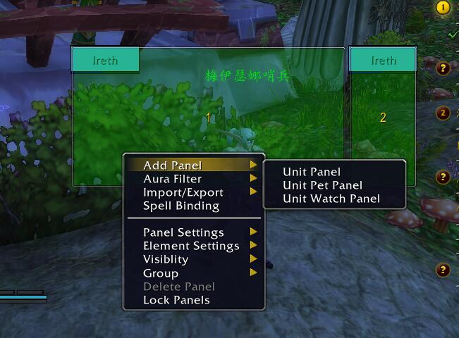 Besides the skin system to make the indicators simple, with the raid panel addon: 1. we can create as many panels as we want, we have unit panels(a dead only mode included), pet panels, watch unit panels(for boss, target, nameplate1 and etc, also "tank", "tanktarget" can be used) 2. re-size and relayout during combat 3. The group member change events may occur many times in the same time, a secure delay system will make sure only do one time re-layout for them, since it's a secure mechanism, works well during combat. I'll focus on the documents for the UI and Skin part, so if any have interesting, you can find docs on the github |
|
|
|
| 03-23-21, 09:14 PM | #11 |
|
For now, the first version introduction for the ui style and the unit frame are all done:
003.ui.md 006.unitframe.md With the Cube Browser, it won't be hard to use. |
|
|
|
| WoWInterface » Developer Discussions » Dev Tools » Scorpio.UI - a new ui & skin system |
«
Previous Thread
|
Next Thread
»
|
| Display Modes |
 Linear Mode Linear Mode |
 Switch to Hybrid Mode Switch to Hybrid Mode |
 Switch to Threaded Mode Switch to Threaded Mode |
|
|

WoWInterface
AddOn Sites
© 2004 - 2022 MMOUI
vBulletin © 2024, Jelsoft Enterprises Ltd