| 02-27-12, 01:34 PM | #1 | |
|
A Kobold Labourer
Join Date: Feb 2012
Posts: 1
|
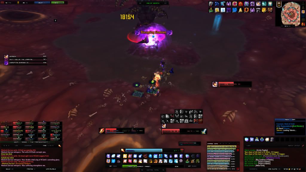
Review my UI!
|
|

|
| 02-27-12, 02:20 PM | #2 | |
|
A Pyroguard Emberseer

Join Date: Jan 2008
Posts: 2,988
|
__________________
♪~ ( ̄。 ̄ ) I ♥ My Sonos! AddOn Authors: If your addon spams the chat box with "Addon v8.3.4.5.3 now loaded!", please add an option to disable it! |
|
|
|

| 02-27-12, 03:26 PM | #3 | |
|
A Molten Giant

Join Date: Dec 2009
Posts: 784
|
||
|
|

| 03-01-12, 04:34 PM | #4 | |
|
Cat.

Join Date: Mar 2006
Posts: 5,617
|
||
|
|
| 03-01-12, 08:47 PM | #5 | |
|
A Molten Giant

Join Date: Oct 2008
Posts: 648
|
__________________
All I see is strobe lights blinding me in my hindsight. |
|
|
|


 Linear Mode


WoWInterface
AddOn Sites
© 2004 - 2022 MMOUI
vBulletin © 2024, Jelsoft Enterprises Ltd