Thread Tools Display Modes
11-20-10, 11:04 AM   #4281
Virion
A Defias Bandit
Join Date: Nov 2010
Posts: 3
My UI. Still working on a few things. Still need a custom border, a bar texture and a few other tweaks. All in all serves very well though.

The icons on the left are from Ovale, the icon above the bag button on the right is from buffwatch. Minimap was reconfigured using chinchilla. There are a lot of nice little touches that you can't see in this shot such as a very clean MikScrollingBattleText config, A nice threatplates setup, and so forth.

http://img51.imageshack.us/i/wowscrn...610214913.jpg/
 
11-20-10, 11:11 AM   #4282
Dawn
A Molten Giant
 
Dawn's Avatar
AddOn Author - Click to view addons
Join Date: May 2006
Posts: 918
Originally Posted by Virion View Post
snip
I highly recommend getting a panel (texture) behind your buttons and using a viewport addon, like rFov.
__________________
Rock: "We're sub-standard DPS. Nerf Paper, Scissors are fine."
Paper: "OMG, WTF, Scissors!"
Scissors: "Rock is OP and Paper are QQers. We need PvP buffs."

"neeh the game wont be remembered as the game who made blizz the most money, it will be remembered as the game who had the most QQ'ers that just couldnt quit the game for some reason..."

 
11-20-10, 12:17 PM   #4283
Elloria
An Onyxian Warder
 
Elloria's Avatar
AddOn Author - Click to view addons
Join Date: Nov 2007
Posts: 358
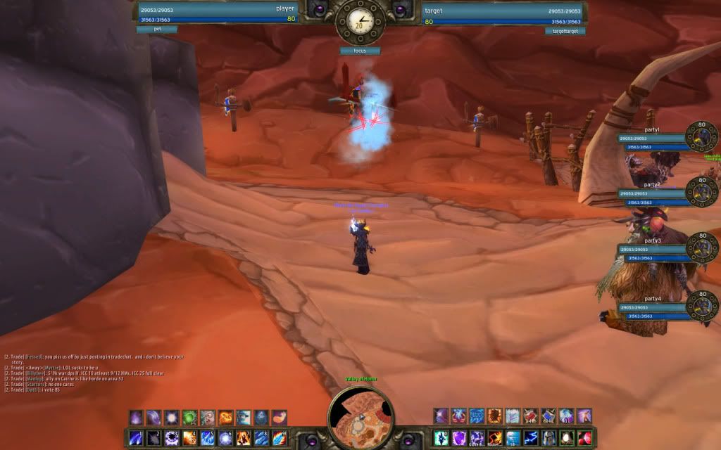
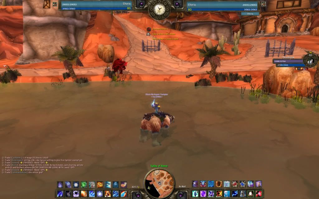
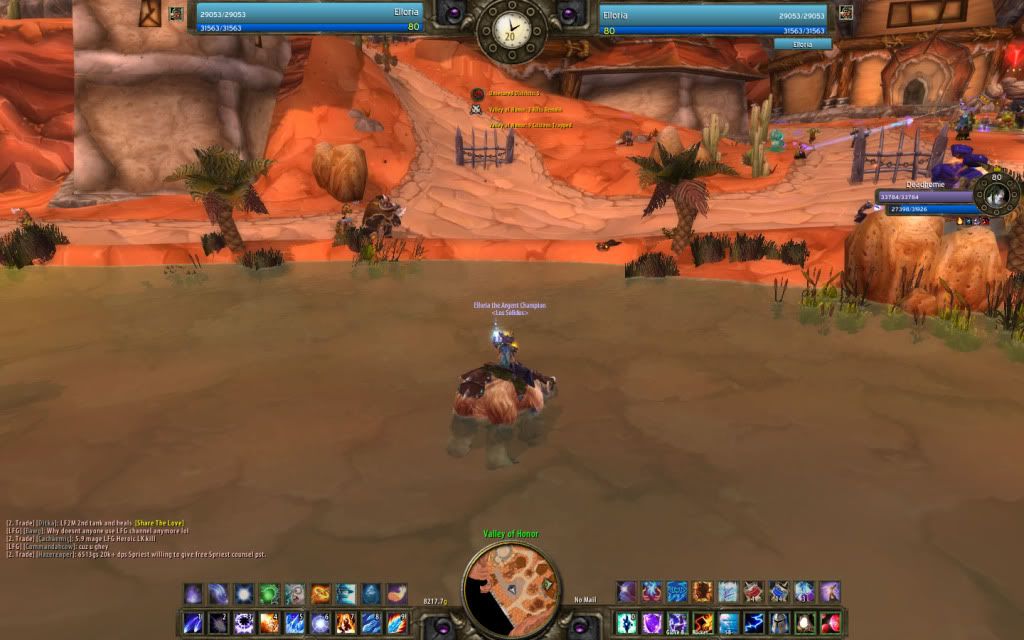
All unit frames are done now

__________________
 
11-20-10, 12:25 PM   #4284
Seerah
Fishing Trainer
 
Seerah's Avatar
WoWInterface Super Mod
Featured
Join Date: Oct 2006
Posts: 10,860
I think you need to try a different statusbar texture for the unit frames, Elloria... That one doesn't seem to fit so well...
__________________
"You'd be surprised how many people violate this simple principle every day of their lives and try to fit square pegs into round holes, ignoring the clear reality that Things Are As They Are." -Benjamin Hoff, The Tao of Pooh

 
11-20-10, 12:29 PM   #4285
Dawn
A Molten Giant
 
Dawn's Avatar
AddOn Author - Click to view addons
Join Date: May 2006
Posts: 918
The bar colors/texture make me sad, maybe make them a little bit more spicy/brighter/colorful ... class colored?

Pretty layout, nonetheless.

E: Seerah beat me.
__________________
Rock: "We're sub-standard DPS. Nerf Paper, Scissors are fine."
Paper: "OMG, WTF, Scissors!"
Scissors: "Rock is OP and Paper are QQers. We need PvP buffs."

"neeh the game wont be remembered as the game who made blizz the most money, it will be remembered as the game who had the most QQ'ers that just couldnt quit the game for some reason..."

 
11-20-10, 12:44 PM   #4286
Elloria
An Onyxian Warder
 
Elloria's Avatar
AddOn Author - Click to view addons
Join Date: Nov 2007
Posts: 358
Alrighty I will try some different status bar textures. The bars are class colored but in config mode it uses my class color which is blue for mage.

Edit:

Eh?


__________________

Last edited by Elloria : 11-20-10 at 12:59 PM.
 
11-20-10, 12:58 PM   #4287
Virion
A Defias Bandit
Join Date: Nov 2010
Posts: 3
Originally Posted by Dawn View Post
I highly recommend getting a panel (texture) behind your buttons and using a viewport addon, like rFov.
Thanks for the heads up on viewport addons.
 
11-20-10, 01:09 PM   #4288
Tobbe8716
An Aku'mai Servant
 
Tobbe8716's Avatar
AddOn Author - Click to view addons
Join Date: Apr 2009
Posts: 36
Interesting theme Elloria, but seems kinda uncomfortable having the UFs up at the top, atleast from where I sit . Never tried it tho.
__________________
Arp UI oUF_Arp
 
11-20-10, 03:35 PM   #4289
Haleth
This Space For Rent
 
Haleth's Avatar
Featured
Join Date: Sep 2008
Posts: 1,173
So, I just made what I think to be the simplest bag addon ever, 33 lines of code excluding inherited functions from my UI. All it does is modify the default bags.

ContainerFrame 3 and 5 don't seem to want to play along though, can't figure out why yet.

 
11-20-10, 03:45 PM   #4290
zork
A Pyroguard Emberseer
 
zork's Avatar
AddOn Author - Click to view addons
Join Date: Jul 2008
Posts: 1,740
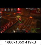
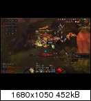
Roth UI 4.004 is finished and available for download.


All frames are now in. Thus only bugfixing until Cata...sweeeeet.
__________________
| Simple is beautiful.
| WoWI AddOns | GitHub | Zork (WoW)

"I wonder what the non-pathetic people are doing tonight?" - Rajesh Koothrappali (The Big Bang Theory)
 
11-20-10, 04:20 PM   #4291
Retraluna
A Murloc Raider
 
Retraluna's Avatar
AddOn Author - Click to view addons
Join Date: Jan 2009
Posts: 9
Originally Posted by zork View Post
Roth UI 4.004 is finished and available for download.


All frames are now in. Thus only bugfixing until Cata...sweeeeet.
can u include the other raidframes too ?
__________________
 
11-20-10, 05:24 PM   #4292
Jooze
A Wyrmkin Dreamwalker
 
Jooze's Avatar
AddOn Compiler - Click to view compilations
Join Date: Jul 2007
Posts: 52
With 4.0.1 i felt forced to rework my entire UI, this is the result:

Idle:


In a heroic:


All the art and data texts coded myself.
Addons include:
ShadowedUF
AzCastBar
Bartender4
Buttonfacade
Perfectraid
Skada
 
11-20-10, 09:14 PM   #4293
Tomine
A Fallenroot Satyr
 
Tomine's Avatar
AddOn Compiler - Click to view compilations
Join Date: May 2009
Posts: 21
Showing a bit of detail in this screenshot ... I am pleased with most of it, but Recount has to change.

Wishing that Omen could grow in directions *other* than from left to right...

 
11-21-10, 02:48 AM   #4294
AcidWeb
A Theradrim Guardian
 
AcidWeb's Avatar
AddOn Author - Click to view addons
Join Date: Oct 2008
Posts: 68
Idle


Combat


I spend about a hour to find out font variable of Bartender hotkeys -.-
And Yes. I like bigger skill buttons
 
11-21-10, 03:03 AM   #4295
voodoodad
Large, Friendly Letters!
 
voodoodad's Avatar
Join Date: Oct 2008
Posts: 1,632
Originally Posted by Elloria View Post
Alrighty I will try some different status bar textures. The bars are class colored but in config mode it uses my class color which is blue for mage.

Edit:

Eh?


Elloria, love the artwork as always. I especially like the clock up there at the top. That looks uber-classy imo.

Just a couple of minor issues;

1. I agree with Tobbe, bring those UF's down and maybe add some artframes to the background.

2. (This is just a nit-pick so you can pretty much ignore it) The Location text above the minimap really sticks out like a sore thumb. I know there's prabably no way to do this, but if you could curve the text output and put a matching border that blends into the minimap frame I think it would look awesome.
__________________

~ no need to make the message completely obnoxious - Cairenn
 
11-21-10, 04:35 AM   #4296
carebear.
Banned
 
carebear.'s Avatar
Join Date: Oct 2010
Posts: 56
Having a fiddle around with a new way to track buffs on targets, player, party and raid. Inspired by an old video I found from a couple of years ago when I had pitbull.

Not the most practical thing but I like it.
http://www.wegame.com/watch/Interface_3/

Little dots above target frame.

Raid Shot

Dawn. With the taglist in oUF slim, how would you get them to track debuffs? If I add a debuff like I would a buff it doesn't work. Is there something different with the way they're tracked?

Last edited by carebear. : 11-21-10 at 04:57 AM.
 
11-21-10, 05:40 AM   #4297
Jaglavak
A Deviate Faerie Dragon
Join Date: Apr 2009
Posts: 11
Originally Posted by zork View Post
Roth UI 4.004 is finished and available for download.


All frames are now in. Thus only bugfixing until Cata...sweeeeet.
I've seen your UI here and there and it looks brilliant. Very nicely done! The only thing I could complain about is the healthbars, they are a but bulky for my taste. Playing a mage and being used to AoE 5-10 mobs at the same time I would see nothing but healthbars on the screen.
 
11-21-10, 06:58 AM   #4298
zork
A Pyroguard Emberseer
 
zork's Avatar
AddOn Author - Click to view addons
Join Date: Jul 2008
Posts: 1,740
Thanks. The nameplates do overlay each other. Screenshot 4 has ~10 small fire mobs. So screen usage is OK.
__________________
| Simple is beautiful.
| WoWI AddOns | GitHub | Zork (WoW)

"I wonder what the non-pathetic people are doing tonight?" - Rajesh Koothrappali (The Big Bang Theory)
 
11-21-10, 07:14 AM   #4299
Elloria
An Onyxian Warder
 
Elloria's Avatar
AddOn Author - Click to view addons
Join Date: Nov 2007
Posts: 358
Originally Posted by voodoodad View Post
Elloria, love the artwork as always. I especially like the clock up there at the top. That looks uber-classy imo.

Just a couple of minor issues;

1. I agree with Tobbe, bring those UF's down and maybe add some artframes to the background.

2. (This is just a nit-pick so you can pretty much ignore it) The Location text above the minimap really sticks out like a sore thumb. I know there's prabably no way to do this, but if you could curve the text output and put a matching border that blends into the minimap frame I think it would look awesome.

Thanks for the comments. I don't want to move the unit frames down because that was the whole purpose of this UI. To do a different lay out then what I always do and to be completely different. As for the minimap text I agree with you on that point. I doubt I could figure out how to bend the text with the map. That would be cool.
__________________
 
11-21-10, 09:04 AM   #4300
ravagernl
Proceritate Corporis
Premium Member
AddOn Author - Click to view addons
Join Date: Feb 2006
Posts: 1,176
Originally Posted by zork View Post
Roth UI 4.004 is finished and available for download.


All frames are now in. Thus only bugfixing until Cata...sweeeeet.
Liking them a lot. Some suggestions/questions:
  • DPS role icons on raid frames (and on party frames perhaps) seem to be superfluous, there will always be more DPS players then there will be healers and tanks. This is a personal preference.
    "Alexsa" also doesn't seem to have a role icon in your last shot, but perhaps this is some caching issue.
  • The outlines below your raid frames (yours is red, we understand that you have aggro) are coloured orange, and yellow or green. What do they represent?
  • A hunter (and even a warlock) might not be satisfied with the default position of the pet UF. I know that it can be moved however so that is no big problem.
  • I have to agree with nameplates being too thick for reasons already explained by other people.
  • Day indicator text(minimap) is at wrong frame layer(the border is above the text). I'm not sure if this is intentional, but I think it looks weird.
  • Presets for rFilter other then the warrior class would be highly appreciated .
  • Rage percentage also seems superfluous
 

WoWInterface » AddOns, Compilations, Macros » UI Screenshots, Feedback and Design Discussion » Screen Shots of your UI...


Posting Rules
You may not post new threads
You may not post replies
You may not post attachments
You may not edit your posts

vB code is On
Smilies are On
[IMG] code is On
HTML code is Off