Thread Tools Display Modes
02-05-11, 08:22 AM   #1
Zagrei
A Cobalt Mageweaver
 
Zagrei's Avatar
AddOn Compiler - Click to view compilations
Join Date: Nov 2009
Posts: 246
UI Feedback Thread

Post screenshots of your UI here, and people can (hopefully!) give you helpful suggestions on what they do/don't like, and how you could make it better! Please keep the posts to fairly large consecutive changes, reposting for every little change you make to the same UI could get tedious


Seerah, feel free to edit this first post to something more official/formal if you wish.
__________________

Last edited by Zagrei : 02-05-11 at 08:39 AM.
 
02-05-11, 08:23 AM   #2
Zagrei
A Cobalt Mageweaver
 
Zagrei's Avatar
AddOn Compiler - Click to view compilations
Join Date: Nov 2009
Posts: 246
I'll start it off! Something I threw together, what do you think? Runic Power is directly behind runes, as you can see in the group shot

Ignore the random minimap icon, I was fiddling with an addon xD
Attached Thumbnails
Click image for larger version

Name:	Screen shot 2011-02-04 at 8.23.05 PM.jpg
Views:	1911
Size:	186.4 KB
ID:	5692  Click image for larger version

Name:	Screen shot 2011-02-04 at 9.03.00 PM.jpg
Views:	3587
Size:	251.2 KB
ID:	5693  
__________________
 
02-05-11, 08:40 AM   #3
Othgar
"That" Guy
 
Othgar's Avatar
AddOn Author - Click to view addons
Join Date: Nov 2010
Posts: 228
Woot feedback thread!

Ok I know I already put this in the SS thread but, I'm looking for some suggestions for my buffs for this UI.


I'm just not happy with them..the debuffs in the center are fine, but the actual buff frame just bugs me, and I haven't found anything I'm with to replace it.
__________________


02-05-11, 08:54 AM   #4
Aftermathhqt
A Molten Giant
 
Aftermathhqt's Avatar
AddOn Author - Click to view addons
Join Date: Dec 2009
Posts: 784
fixed the position of the actionbar, looks abit better, made the textures abit darker, looks damn cool, so here is my shammy with tial waves stacks, and water shield and thanks Seerah for the tip of align
Attached Thumbnails
Click image for larger version

Name:	WoWScrnShot_020511_142255.jpg
Views:	1793
Size:	1.70 MB
ID:	5694  
 
02-05-11, 08:59 AM   #5
Zagrei
A Cobalt Mageweaver
 
Zagrei's Avatar
AddOn Compiler - Click to view compilations
Join Date: Nov 2009
Posts: 246
Originally Posted by Game92 View Post
fixed the position of the actionbar, looks abit better, made the textures abit darker, looks damn cool, so here is my shammy with tial waves stacks, and water shield and thanks Seerah for the tip of align
It looks good, Game! I'm happy to see that you have made good use of Align, as your older pictures sometimes made my OCD flare up :P One thing: why is the texture on your castbars different from your unitframes? Also, do your damage meters expand all the way to the bottom level of your UI?
__________________
 
02-05-11, 09:19 AM   #6
Aftermathhqt
A Molten Giant
 
Aftermathhqt's Avatar
AddOn Author - Click to view addons
Join Date: Dec 2009
Posts: 784
Originally Posted by Zagrei View Post
It looks good, Game! I'm happy to see that you have made good use of Align, as your older pictures sometimes made my OCD flare up :P One thing: why is the texture on your castbars different from your unitframes? Also, do your damage meters expand all the way to the bottom level of your UI?
Thanks, yeah, i know that i don't know why too, I can't find the wrong, why it isnt like the castbar. yeah, untill the bottom panel, like omen.
 
02-05-11, 08:56 AM   #7
Zagrei
A Cobalt Mageweaver
 
Zagrei's Avatar
AddOn Compiler - Click to view compilations
Join Date: Nov 2009
Posts: 246
Originally Posted by Othgar View Post
...I'm looking for some suggestions for my buffs for this UI.

I'm just not happy with them..the debuffs in the center are fine, but the actual buff frame just bugs me, and I haven't found anything I'm with to replace it.
Well, I use Satrina Buff Frames, which is not going to be updated any more (sadly ) As far as buff layout goes, it's always been tricky to figure out for vertical HP bars... the place you have them seems alright-ish. I would suggest filtering out your long-term buffs and putting them somewhere out of sight (sich as in the upper right corner, or something), and then putting only your procs and cooldowns in the place where your buffs are right now. Just a thought
__________________
 
02-05-11, 09:32 AM   #8
Othgar
"That" Guy
 
Othgar's Avatar
AddOn Author - Click to view addons
Join Date: Nov 2010
Posts: 228
Originally Posted by Zagrei View Post
Well, I use Satrina Buff Frames, which is not going to be updated any more (sadly ) As far as buff layout goes, it's always been tricky to figure out for vertical HP bars... the place you have them seems alright-ish. I would suggest filtering out your long-term buffs and putting them somewhere out of sight (sich as in the upper right corner, or something), and then putting only your procs and cooldowns in the place where your buffs are right now. Just a thought
I think I'll give that a try. Thanks!
__________________


02-05-11, 09:32 AM   #9
Zagrei
A Cobalt Mageweaver
 
Zagrei's Avatar
AddOn Compiler - Click to view compilations
Join Date: Nov 2009
Posts: 246
Originally Posted by Othgar View Post
I think I'll give that a try. Thanks!
Yep, no problem
__________________
 
02-05-11, 09:33 AM   #10
Othgar
"That" Guy
 
Othgar's Avatar
AddOn Author - Click to view addons
Join Date: Nov 2010
Posts: 228
Originally Posted by Zagrei View Post
I'll start it off! Something I threw together, what do you think? Runic Power is directly behind runes, as you can see in the group shot

Ignore the random minimap icon, I was fiddling with an addon xD
I like the runic power behind the runes looks clean. I think I might have gone with red for the RP though, but that's just me.
__________________


02-05-11, 09:36 AM   #11
Zagrei
A Cobalt Mageweaver
 
Zagrei's Avatar
AddOn Compiler - Click to view compilations
Join Date: Nov 2009
Posts: 246
Originally Posted by Othgar View Post
I like the runic power behind the runes looks clean. I think I might have gone with red for the RP though, but that's just me.
Thanks I tried a whole bunch of different colors, and they were all too distracting and stuff =/ I use that bar pretty much only to check how much I have total, pretty much just for Lichborne and DRW. I'm gonna keep looking for a good color, though
__________________
 
02-17-11, 03:32 AM   #12
Rhoads
A Deviate Faerie Dragon
AddOn Compiler - Click to view compilations
Join Date: Jun 2009
Posts: 16
Capity UI 1.0 rate, comment and feeback! :)


I wanted to make a simple yet functioning arena based UI. I wanted to keep the "RP" feeling by borrowing some textures from RothUI, which is amazing but the other addons doesn't suit my play style.

I made gladius and my party frames match, just for the looks. Kind of gets the commented arena matches style were they are identical to keep track of whats going on for the spectator.

Reason for the big portrait in the middle showing the class of the target is to make it easier getting the right target in the arena, and also make me able to play without classcolord bars (i hate those:P).

Comment and give some feedback. May upload if anyone wants it.
 
02-17-11, 03:53 AM   #13
Jaglavak
A Deviate Faerie Dragon
Join Date: Apr 2009
Posts: 11
Looks very nice. Maybe add the texture to the actionbars also. What is that bar in the bottom right corner, a tank frame?

But what about:
- Raid frames? (I know you said its a Arena based UI, but if you are going to let people download it there should be some Raid frames also.)
- Nameplates?
- Buffs/debuffs?
 
02-17-11, 04:05 AM   #14
Toidi2k
A Murloc Raider
AddOn Compiler - Click to view compilations
Join Date: Aug 2006
Posts: 6
It looks very nice. I like the clean style to have more look from the rest of the game:-) plz share this addon:-)

Last edited by Toidi2k : 02-17-11 at 04:08 AM.
 
02-17-11, 04:51 AM   #15
Rhoads
A Deviate Faerie Dragon
AddOn Compiler - Click to view compilations
Join Date: Jun 2009
Posts: 16

I have no put much effort in the raid frames tbh. Still a work in progress.
the bar in the bottom right corner is actually a dmg meter. It's not supposed to show outside of raids.
 
02-17-11, 05:05 AM   #16
Jaglavak
A Deviate Faerie Dragon
Join Date: Apr 2009
Posts: 11
Ah you are using the Roth UI nameplates. Great UI but the nameplates are to big for my taste.
 
03-14-11, 05:47 PM   #17
Blightus
A Defias Bandit
AddOn Author - Click to view addons
Join Date: Feb 2009
Posts: 3
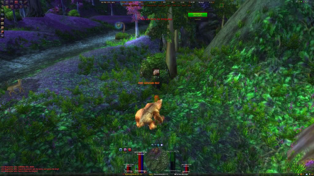
What do you think of my layout?

I'm designing a new interface, and I'm looking for some C&C on it. I threw this together in photoshop, so try and picture it without all the white backgrounds and stuff.

Also, i just grabbed a random pic from google images for the background so you can see where everything is in relation to the play screen.

Let me know what you think!

 
05-08-11, 08:44 PM   #18
Uitat
A Chromatic Dragonspawn
 
Uitat's Avatar
AddOn Author - Click to view addons
Join Date: May 2011
Posts: 162
UI-tat

this is my new design, it is fully inclusive, no external addons so far
right now i just have the action bars and the lower frame skin done, likely next will be the minimap

any suggestions on what i could do different, ??? im glad to take suggestions and work them into it...
Attached Thumbnails
Click image for larger version

Name:	WoWScrnShot_050811_153020.jpg
Views:	995
Size:	783.1 KB
ID:	6146  
__________________
 

WoWInterface » AddOns, Compilations, Macros » UI Screenshots, Feedback and Design Discussion » UI Feedback Thread

Thread Tools
Display Modes

Posting Rules
You may not post new threads
You may not post replies
You may not post attachments
You may not edit your posts

vB code is On
Smilies are On
[IMG] code is On
HTML code is Off