|
|
| 04-05-12, 09:44 AM | #1 | |
|
A Deviate Faerie Dragon
Join Date: Jan 2011
Posts: 19
|
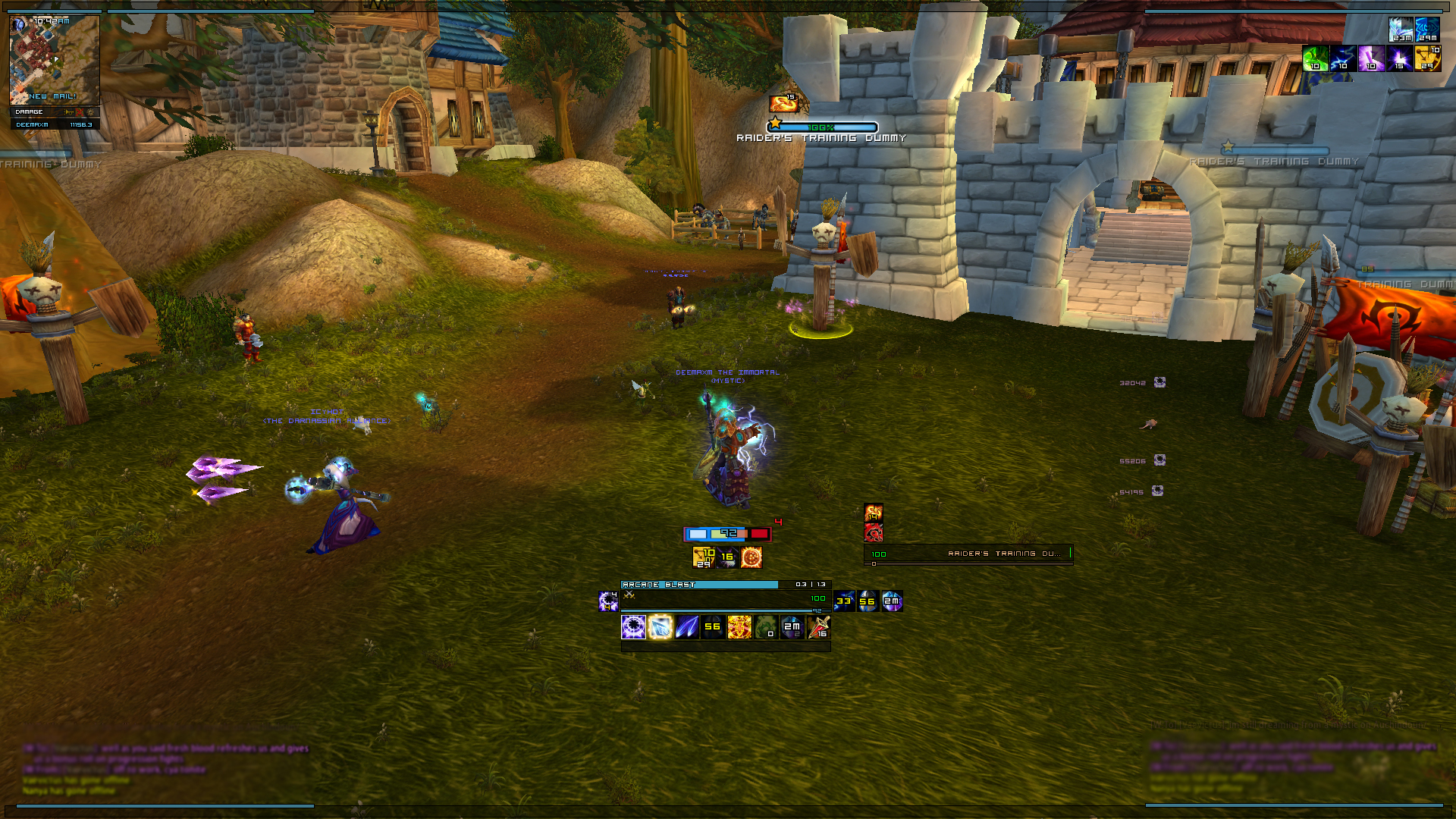
DeeUI 4 Feedback
|
|

|


| 04-05-12, 09:52 AM | #2 | ||
|
Lookin' Good

Join Date: Aug 2008
Posts: 484
|
__________________

|
||
|
|
| 04-05-12, 10:35 AM | #3 | |
|
A Deviate Faerie Dragon
Join Date: Jan 2011
Posts: 19
|
||
|
|


| 04-05-12, 12:29 PM | #4 | |
|
A Warpwood Thunder Caller

Join Date: Oct 2008
Posts: 92
|
||
|
|
| 04-05-12, 02:02 PM | #5 | |
|
A Deviate Faerie Dragon
Join Date: Jan 2011
Posts: 19
|
||
|
|
| 04-05-12, 02:20 PM | #6 | |
|
A Molten Giant

Join Date: Oct 2008
Posts: 648
|
__________________
All I see is strobe lights blinding me in my hindsight. |
|
|
|


 Hybrid Mode

WoWInterface
AddOn Sites
© 2004 - 2022 MMOUI
vBulletin © 2024, Jelsoft Enterprises Ltd