WoWInterface
» Featured Projects
» nUI, MozzFullWorldMap and PartySpotter
» Support
» nUI: Technical Support
»
nUI -- A full feature standalone UI replacement
| Go to Page... |
| Thread Tools | Display Modes |
| 08-06-08, 01:10 PM | #341 | |
~evil grin~ Actually... the unit frames are 100% skinnable in the beta 2. I mean EVERYTHING about them can be customized at the drop of a hat... what features are in the frame, where they are in the frame, their size, orientation, etc. That said, until I can write the infamous GUI config, it means creating an LUA source file for the unit type that you're changing... but it's very easy... no programming, just data values. The cool thing is that the new design makes it possible to offer an infinate number of unit frame designs and layouts that are 100% TIGHTLY integrated into the UI. So... while what I am working on now is what I intend the default nUI unit layouts to look like, it will be a cinch to create alternate layouts and offer them as independent downloads. You'll just go to your AddOn manager in WoW and disable the nUI default unit skins and enable the alternate set and bam, you're done. |
||

| 08-06-08, 01:16 PM | #342 |
|
~Vexing Glare~
Wow i like that! incase you missed this post here it is  . .
__________________
If science and religion are destroyed, science would re-emerge exactly the same; but not religion. Last edited by noble8 : 08-06-08 at 01:18 PM. |
|

| 08-06-08, 01:31 PM | #343 | ||||||||
If you go back a few messages, you'll see the screencap I just did for the new player/solo unit frames. That entire center reqion where you saw those frames is now a panel just like the panel on the right... with its own click-through button. You can now click a button to switch that center region of the the dashboard from single player/solo mode to party/group mode, 10 player raid, 15 player raid, 25 player raid and 40 player raid. And, if that isn't enough, the center panel now supports plug-in panel modes, so you (or someone else) can create a set of data files that describe what you want the new panel to look like and nUI will automatically pick the new panel design up and add it to the rotation.
Rather, I would argue that either you don't want to use the nUI feature simply because it's different and you're resisting change or because there's some particular functionality in the other mod that isn't present in nUI. There's nothing I can do about being resistant to change, but if it's a missing feature, I would rather know there's a need for it and add it. The Beta 2 is, for all practical purposes, best described as a 100% object oriented state machine. If you're not a programmer, that probably doesn't mean much, but in layman's terms it means that if there's a new feature needed, I can create a module to handle it, drop it in and nUI will use it without breaking what was already there. Odds are that any functionality that you "miss" in your old addons can be configured to look like it in nUI or can be added to nUI if not already present. It's this new approach to this mod that has made the Beta 2 take so much longer than my original 2 week plan... once it hit me that this was the "right" way to approach this and the benefits to both myself and the users that go with it, the Beta 2 went from rearranging the unit frames to a 100% new code base. You have NO idea the hours that I have crammed into this short two weeks that have passed... I put in 20 hours yesterday alone. ~smile~
Thanks again for the kind words and the feedback. |
|||||||||
| 08-06-08, 01:59 PM | #344 | |
Here you go Noble... just for you... ~smile~ This won't be the dedault, but I just wanted to show you how easy it was to change the unit frames. Between the time of my last post and now I created this new layout for the player frame, tested it, screencap'd it and posted back. Nearly painless ~smile~ |
||
| 08-06-08, 02:05 PM | #345 | |
Not that I want to encourage anyone to not use nUI, but here's a panel that looks a lot like mine that anyone can build a UI on. http://www.wowinterface.com/downloads/info9265.html That wouldn't be that "your wish is my command" thing again would it? ~lol~ |
||
| 08-06-08, 02:45 PM | #346 |
|
Spiel, I have to say that beta 2 is really looking and sounding great, and from the description I will surely be testing it out. I'm not a fan of changing UI's once I get used to the one I'm playing with, but from what I'm seeing and reading on nUI, I'm sure you've got a convert here.
I'd like to ask you a couple of questions:
Keep up the great work and especially your great attitude towards the people in this community! I really have to commend you on that! Looking forward to beta 2! |
|

| 08-06-08, 03:06 PM | #347 |
|
lol As a matter of fact, I am a programmer, but still relatively early in my college's course. I think I've underestimated the modularity of your new codebase, and I'm excited that beta2 sounds like it will be exactly what I'm looking for! I've also underestimated your willingness to add features and adapt things to your users preferences. Since you've encouraged me by being so gracious, I'll offer the specific points of improvement I was witholding earlier when I became discouraged, thinking there was no way they could all be realized.
I'm not at home, so I don't have the list of all the Grid plugins I use, but there are several. It's setup to show who's missing my class buffs, who's got aggro (when I'm tanking) and who's got a shield or IB (probably about to start taking damage), who's got curses (on my mage), who's missing how much HP (for healing of course) and how many lifebloom stacks do they have, and who's already got HOTS from other healers so I can work on people that need healing, raid mana, and readycheck statuses. If your raid frames can show me all that stuff, then great. Here's me being a doubting Thomas though, and not thinking your frame will be able to take Grid's place in my heart. So if that's the case, I'll still hope to be able to drop Grid in to replace your frame. You're absolutely right about me being resistant to change, but I recognized that, and tried to explain that I'd try to be patient and give all your setups so different from what I've used for so long a chance. Here's the specific thoughts on features I'm missing / hoping for. I can't vouch for whether these are "needed" changes, I'll just give you one person's views and let you take it from there. My current Quartz was left at the size it was when I installed it, which is about 3x as wide as your casting bar. It has a colored portion at the end of the bar that shows when I should cast my next spell to take advantage of latency. It's fairly big and easy to see. With the blue bar on your casting bar, I can't really see when it's reached the end and it's time to cast. Maybe it's just too small, maybe it should show as a portion of the cast bar itself (like quartz) instead of it's own moving little blue bar, but I need something I can see better. (My screen's currently 1600x1200 if that affects why it's so small for me, moving to 1920x1200 as soon as I can afford it) The buff bars, I'm not nearly so set in my ways. I can't imagine there's room the way the buffs are spaced for all my raid buffs on the left side (though I didn't actually get to try it out on my mains yet) without going up into multiple rows. I think what I like most about EBB is having them very skinny in a tall stack. Debuffs are on bottom, and I always know where to look to see what's on me. Sorting vertically by time remaining allows me to find my Ice Block very quickly (almost always at the very bottom of my buffs) and r-click it off so I can get back into the PvP. lol As I think about why I like it, it really is hard to accept that I may need to get used to something new. But especially considering how powerful v2 will be, you can rest assured I'll slog through the adjustment phase until I'm OK with it! My other concern was, is this going to go the way of Mazzle come WoW 3.1? How long do you think you'll be in on this project? So, I don't think I saw this in the posts I did read, but ... when can I expect to be able to test drive beta 2? Soon? (Like, the same kind of soon where Blizzard's going to get us our beta keys "soon"?) lol You're awesome! Don't forget to take some well-deserved ice cream breaks and stuff while you're coding. |
|

| 08-06-08, 03:12 PM | #348 |
|
Well I have been playing around with this UI since I got home from work and there is a lot I like about it. The thing I actually dislike the most is the dashboard. IMO the dashboard basically forces too much rigidity in the layout - some of which is being addressed in Beta 2 with the configurable unit frames but as far as I can see not all.
For Example when I am playing single player I play at 1680x1050 and at this resolution imo the dashboard is too big and takes up to much real estate. Scaling down the ui is a workaround but leaves you with wasted space. When I 5 box I use resolutions as small as 560x480 (on my slaves) and the frames are much too small at the res to be useful (obviously). In the scenario I can not adjust the scale as the UI then goes off the screen. What I would really like to see is a no dashboard version that allows drag and drop resizing of all the frames so when im in 560x480 mode I can increase the vertical scale and rearrange the frames I need into a larger more readable form and when im in 1680x1050 I can scale down and claim back some space. ps I tried removing the dashboard artwork and got a green background  is there an easy way to make the background transparent? (if so I can maybe fiddle around with the lua and rearrange the frames as necessary) is there an easy way to make the background transparent? (if so I can maybe fiddle around with the lua and rearrange the frames as necessary) |
|
| 08-06-08, 03:34 PM | #349 |
|
One other thought I had is that not all minimap buttons need to show all the time (or even most of the time). Perhaps an approach similar to Minimap Button Frame, where I toggle the button frame on and off. That would give us a little more real estate in the right frame.
|
|
| 08-06-08, 03:41 PM | #350 | |
 Really, though, thank you man. You've put a lot of hard work on this, and we all appreciate it a great deal.
__________________

|
||

| 08-06-08, 03:50 PM | #351 |
|
Sorry just got back home to read your reply and while investigating the screenshots you already put forward combined by your further posts I see I will only gain functionality and not loose (grin from side to side right now)
|
|
| 08-06-08, 03:51 PM | #352 | |
Awesome. |
||
| 08-06-08, 04:05 PM | #353 | |
I can't wait to get hold of this
__________________
If science and religion are destroyed, science would re-emerge exactly the same; but not religion. |
||
| 08-06-08, 06:07 PM | #354 |
|
I've been using nUI again the past few days, trying to get used to it again in preparation for the next release, but the same old things still bother me.
The font size of the combat window tab still looks like it's 4 points smaller than whatever /nui fontsize number I enter in the main window. Same with any subsequent chat tab I add. Am I the only one that this happens to? Also, how come your font sizes don't match the ones you can set by default in the right click menu? I am a long time Bartender mod user, and it has been one of the hardest mods to give up in place of nUI, at least on my feral Druid. One thing I have gotten used to is the intuitive yet fully configurable hotbar swapping. While your main bar does swap when I change into cat or dire bear form, what about when I use Prowl? Bartender took care of this automatically, but I'm having a hell of a time butchering my macros to add in action bar swaps that work just when I need them  . Rogues get a stealth bar with nUI, is there any way to throw that in for feral Druids too? . Rogues get a stealth bar with nUI, is there any way to throw that in for feral Druids too?Also, a request along the same vein, mods like Bartender, Bongos and Autobar use a library called LibKeyBound-1.0 which is "An intuitive keybindings library" that lets you assign keybindings to any actionbar button on the fly with the /kb command. It would be so awesome if you could integrate (or mimic) this functionality for nUI's hotbars! Anything beats having to dig around the default keybindings menu. The group window...is painfully small to me, and it's the same at any resolution right? Tiny health bars, tiny text, and I've got glasses now, so I can see clearly whatever is actually clear to begin with (and we all know how "clear" blizz fonts are when shrunk)! Now, I don't know what plans you have for the group window in Beta 2, but I would really love to see this window be really maximized within its alloted space. Maybe you could trim down the borders around all the various elements like portraits and class icons, or make the HP bars "fatter" so they stand out more? Just a couple of ideas .I'm really looking forward to the Beta 2 release, lots of good changes and new stuff, I just want the old stuff to be the best it can be also! Regards,
__________________
Serenissima of Malfurion |
|

| 08-06-08, 07:03 PM | #355 |
|
One of the many features of the original nUI was the placement of buffs/debuffs. It took a bit of gettin used but i found the were in a really good spot. SO my question is, would it be possible to have the buffs were they are now in nUI1 and make all the unit frames look like focus frame Health bar one side, full image of target in middle mana bar on other side.
If not that is fine, i am sure i will get used to the new way you have it set up. Just thought i would ask. Brillian work. Thanks heaps |
|

| 08-06-08, 07:20 PM | #356 |
|
Ok, it's official. I took the plunge. I cleaned out my AddOns folder and went nUI on all of my characters. My official AddOn list is now as follows:
Auctioneer Full 5.0.0 Suite (Preview) (2.4) - AH Mules Only Clique (2.4) - Casters Only EasyUrl (2.4) - All Characters EquipCompare (2.4) - All Characters Fishing Buddy (2.4) - Fishermen Only Fizzwidget Feed-O-Matic (2.4) - Hunters Only Fizzwidget Gemologist (2.4) - Jewelcrafters Only Fizzwidget Hunter's Helper (2.4) - Hunters Only Fizzwidget Linkerator (2.4) - All Characters Movable Bags (2.4) - All Characters nUI (2.4) - All Characters Omen Threat Meter (2.4) - All Characters Poisoner - Rogues Only QuestHelper (2.4) - All Characters Recount (Preservation) - All Characters teksLoot (2.4) - All Characters TomTom (2.4) - All Characters If the new, improved, OOP approach to nUI eventually replaces the functionality of any of these AddOns, that would be cool, too :-) I understand that nUI is strictly a UI, not a data mod. So, I can pretty much figure out which of these things won't ever been seen as an addition to nUI. But, some things that nUI probably could replace... * EasyUrl, which detects emails and URLs in chat and makes them clickable, so you can copy / paste them. Already discussed with Spiel, and will possibly be part of the major chat functionality overhaul he's planning. * Fishing Buddy's double R-click cast feature... that's all I use it for, anyway. * EquipCompare, which shows you what you currently have equipped in a slot when you mouse-over a piece of gear, for the sake of comparison. * MovableBags, lets me move my bags around the screen. * teksLoot, makes a more compact loot roll dialog. But, more importantly, it's movable. |
|
| 08-06-08, 07:43 PM | #357 |
|
Okay... I have been playing with the idea of creating a buff watch list that's easy to look at and this kind of follows along the line of "will buffs still be in the same place"
In a word... no. Or, more accurately... no on buffs, yes on debuffs. The debuffs on you, your pet and friendlies will still appear on the HUD right next to the health bars. Likewise, the buffs on hostile targets and/or ToT's will also still appear on the HUD next to their health bars. In other words... the things that are detrimental to you still stay where they are on the HUD. That said, I always hated where I had located the player's buffs (and player pet) as well at target debuffs... in that block just above the dashboard. It was hard to look at (to me) and took up way too much space. So... I want to move that info into the unit frames for the most part. This is also to the benefit of those who do not want to use a HUD. With that in mind, and the conversation earlier today about having buff bars you can look at, I've come up with the following solution... (see the attached image) I'll point out this is all configurable, so a "skin" can be made with relative ease that lays this all out differently. Anyway, in this design, the "detail" information about the player's buffs appear in the top left of the screen in a sorted list if you will. It shows what the buffs are, their name, time remaining and number of applications where required. At the same time, the icons for those buffs appear as small and unobtrusive buttons in the bottom of the player's unit frame. If there is an application count, that is shown on the buff button in the unit frame, but timers are not. A buff that is about to expire will begin to flash in the unit frame and that would be your cue that it's time to refesh or to look at the upper left for status. This way the buttons are very clean in the unit frame, but the information is readily available if you need it and generally located out of the way. You can see that debuffs on the player also appear in the unit frame, only they are larger (for visibility) and include timers. So... tell me your thoughts on this approach. |
|
| 08-06-08, 08:57 PM | #358 | |
What are those empty little squares in the corner of the portraits on the unit frames? |
||
| 08-06-08, 09:04 PM | #359 | |
And those squares are actually a bug in the unit frames I'm working on. |
||
| 08-06-08, 10:31 PM | #360 |
|
Trades bar and Chat bar
i love the look so far and im really looking forward to the released beta 2.
I have a question on a few mods i use and if there is a possibility of incorporating the functions into nUI 1. Tradesbar. - is there any way to incorporate a trades bar with hearth and mount button into the top of the ui just under the buttons and above the latency and frame rate bar. I have a pic of what mine looks like now but think it would look much better inside the UI graphic. And for the mount function.. is there a way to make it to where left click is for ground mount and right click for flying mount. and with the hearth button a way to add a right click for druids that port them to moonglade and for shamman it would use their Astra recal spell when right clicked?  2. chat bar - the second one i use that came from cosmos is a chat bar with buttons for each chat channel. it more of a convince to me but i enjoy just clicking the button for the channel i desire to use. and if this chat bar could be along the left or right side of the chat window and have a function for stickychat and a function so that the chat input box can be on the top of the chat box rather than the bottom.. the only problem i see is the dependency needed for the cosmos version of chatbar.  but these added to the nUI would reduce additional interface addons and free up some more of the action bars for macros, spells and such for those that dont already have tradesbar. Oh and also what about adding some configurable totem timers to the UI for shaman. Something that will allow for the right click to dismiss the specific totem. An onscreen warning at 10 sec and the timer for the totem expiring would flash . just an idea.. AS of now i am using "Got Wood". here is what it looks like with my timers and my totemus showing 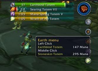 I appologige if this seems like alot.. but will nUI have the druid bar function so when your in cat or bear form you can still see what your mana is at? would be a great thing to have i used to use druid bar, when me and my wife went to nUI she has been asking about that again... Thanks for your time and great work.. i wish i knew how to do the coding. im just starting my junior year of my computer science degree and will be starting programming course this year.. Thanks Balthisar Myrmidons Guild of Llane Last edited by mscott998 : 08-06-08 at 11:07 PM. |
|
| WoWInterface » Featured Projects » nUI, MozzFullWorldMap and PartySpotter » Support » nUI: Technical Support » nUI -- A full feature standalone UI replacement |
«
Previous Thread
|
Next Thread
»
|
| Display Modes |
 Linear Mode Linear Mode |
 Switch to Hybrid Mode Switch to Hybrid Mode |
 Switch to Threaded Mode Switch to Threaded Mode |
|
|

WoWInterface
AddOn Sites
© 2004 - 2022 MMOUI
vBulletin © 2024, Jelsoft Enterprises Ltd